
AI Bar Chart Maker and Bar Graph Maker
Paste a CSV or your numbers and get an exact bar chart — grouped and multi-series bars supported, every value rendered exactly as entered. No manual axis scaling, no bar-width fiddling, no AI image model guessing at your data.
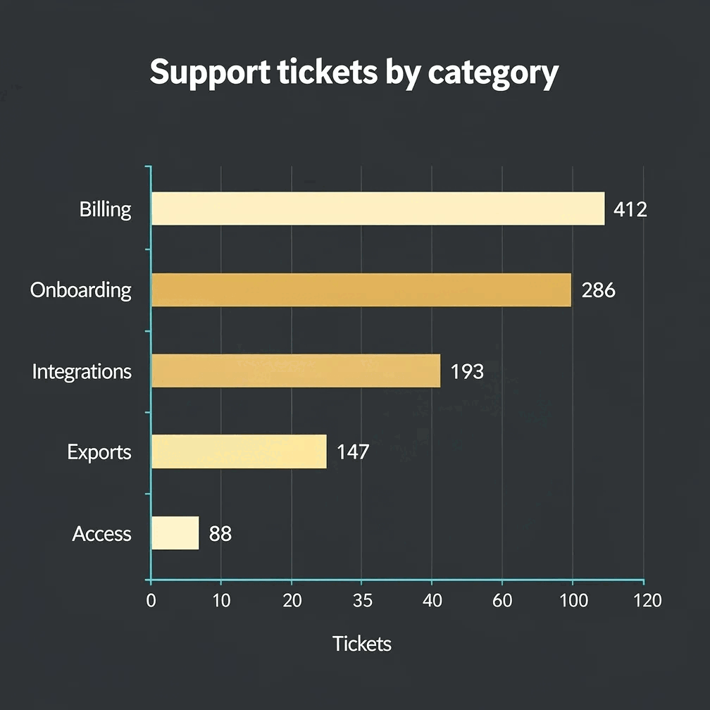
Gixo Prism's bar chart maker is deterministic — no AI image model in the loop. Paste a CSV or type your numbers and Prism renders them to clean SVG, with grouped and multi-series bars supported for comparing categories side by side. The value you enter is the value that appears: never rounded, never invented, never garbled.
What makes a bar chart maker trustworthy?
The bars have to match your data — not an AI's approximation of it.
Paste a CSV or type your numbers and Prism renders each bar to scale from the real values — deterministic SVG, never rounded or invented.
Compare categories side by side with grouped bars, or track several series at once — no manual axis scaling or bar-width fiddling required.
Four theme presets — conservative, bold, brand-conservative (default), and brand-bold — plus your own Brand Kit, applied consistently across every bar.
Adjust the data, labels, or theme and the chart re-renders exactly. Export as clean, self-contained HTML/SVG for your deck, doc, or page.
Same maker, same exactness: line, area, pie, donut, scatter, radar, waterfall, funnel, Gantt, combo, heatmap, treemap, and symbol-map charts are one click away when the data calls for a different shape.
How do you make a bar chart with Gixo Prism?
Bring your data as-is — categories and values, one or more series.
Deterministic SVG output, scaled and grouped correctly — no AI model guessing at your values.
Pick a preset or use your Brand Kit so the chart matches your deck or page.
Clean, self-contained output ready to drop into a deck, doc, or page.
Types of charts: every chart type Prism renders
A bar chart is one of sixteen. All of them render the same way — deterministically to SVG from the numbers you supply, with no AI image model between your data and the picture. Pick the chart that matches the question you are answering, not the one that looks busiest.
Bar and column charts for ranked categories, a grouped bar chart for two dimensions side by side, a stacked bar chart for parts of a total, and a horizontal bar graph when the category labels are long. Line graph maker for change over time, and a combo chart when one series is a rate and the other a volume.
A pie chart or donut chart for a handful of shares, a treemap when there are too many categories for a pie to stay readable, and a funnel chart for stage-by-stage drop-off.
A scatter chart — also called a scatter graph — for correlation between two measures, a heatmap for density across two dimensions, and a radar chart, sometimes called a web chart or spider chart, for comparing several entities across the same set of criteria.
A waterfall chart for how a total was arrived at, a Gantt chart for schedule, an organizational chart maker for reporting hierarchy, and a symbol map chart when the categories are places.
The same rule applies across all of them: the value you enter is the value that appears. Prism renders from your figures rather than generating an image of a chart, which is why a radar chart maker and a bar chart maker behave identically here — only the geometry changes. Review the output before you publish it; the renderer is deterministic, but the judgement about whether the chart answers the question stays yours.
Frequently Asked Questions
Explore the Prism chart toolkit
Updated