
Scatter Plot Maker
Paste your paired x/y data and get an exact scatter plot — every point placed from the real coordinates you entered. No manual axis scaling, no dragging dots into place, no AI image model guessing at where your points go.
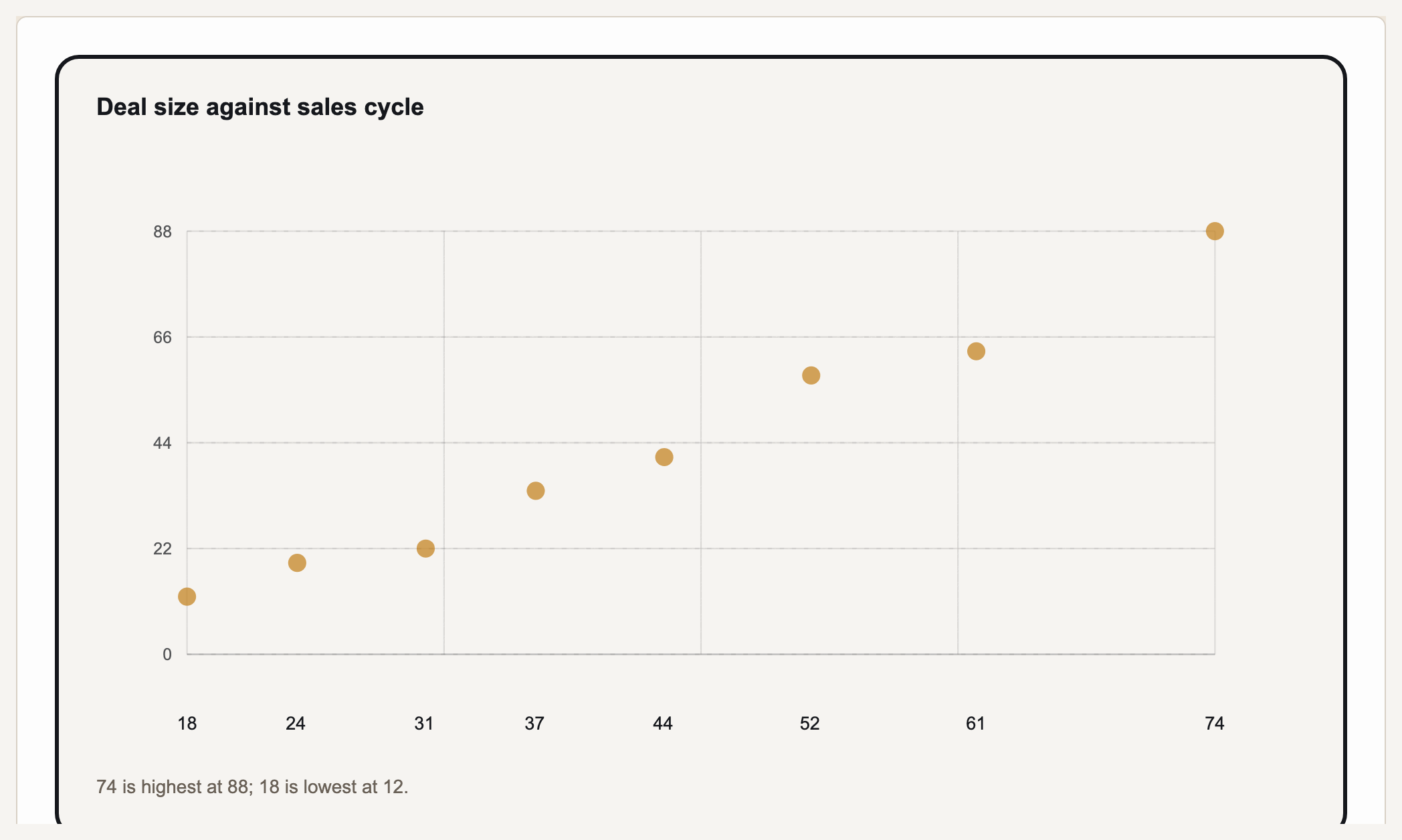
A scatter plot (also called an xy graph or scatter chart) shows the relationship between two variables by plotting each observation as a single point on an x-axis and y-axis. The pattern of points reveals correlation — whether y tends to rise, fall, or stay flat as x increases. Gixo Prism's scatter plot maker is deterministic: paste your paired x/y values and Prism places each point at its exact coordinates in clean SVG, with no AI image model in the loop. The coordinate you enter is the coordinate that appears — never nudged, never approximated.
How to prepare an x and y graph
An x and y graph needs one paired observation per row: the x value in one column and its corresponding y value in the next. Use the horizontal x-axis for the explanatory or first variable and the vertical y-axis for the response variable. Prism then renders an exact x and y axis graph, so any correlation or outlier comes from your coordinates rather than from manual placement.
A real Gixo Prism scatter plot. Every point sits where your data puts it.
What makes a scatter plot maker trustworthy?
The points have to sit exactly where your data puts them — an approximated cloud of dots isn't a scatter plot, it's a picture of one.
Paste paired x/y values or a CSV and Prism plots each point at its true coordinates — deterministic SVG, never nudged, rounded, or invented.
A scatter plot's whole job is to show how two variables relate. With points placed exactly, the shape you see — rising, falling, or scattered — is the real pattern in your numbers.
Prism scales both axes to your data automatically and labels them — the independent variable on x, the response on y — so the graph reads correctly with no manual axis fiddling.
Four theme presets — conservative, bold, brand-conservative (default), and brand-bold — plus your own Brand Kit, applied consistently to every point and axis.
Adjust the data, labels, or theme and the plot re-renders exactly. Export as clean, self-contained HTML/SVG for your deck, doc, or page.
Same maker, same exactness: bar in three variants, line, area, pie, donut, radar, waterfall, funnel, Gantt, combo, heatmap, treemap, and symbol-map charts are one click away when the data calls for a different shape.
How do you make an xy graph, scatter chart, or scatter plot in Gixo Prism?
Four steps from paired numbers to an exact, on-brand xy graph.
Bring your data as-is — one x value and one y value per observation, from a CSV or typed in.
Deterministic SVG output, each point at its true coordinates and both axes scaled to your data — no AI model guessing at placement.
Name the x and y axes, then pick a preset or your Brand Kit so the graph matches your deck or page.
Clean, self-contained output ready to drop into a deck, doc, or page.
Frequently Asked Questions
Explore the Prism chart toolkit
Updated