
Donut Chart Maker
Paste your values or percentages and get an exact donut chart — every segment rendered exactly as entered, with a hollow center that leaves room for your own headline number. No manual arc math, no dragging slices to fit, no AI image model guessing at your data.
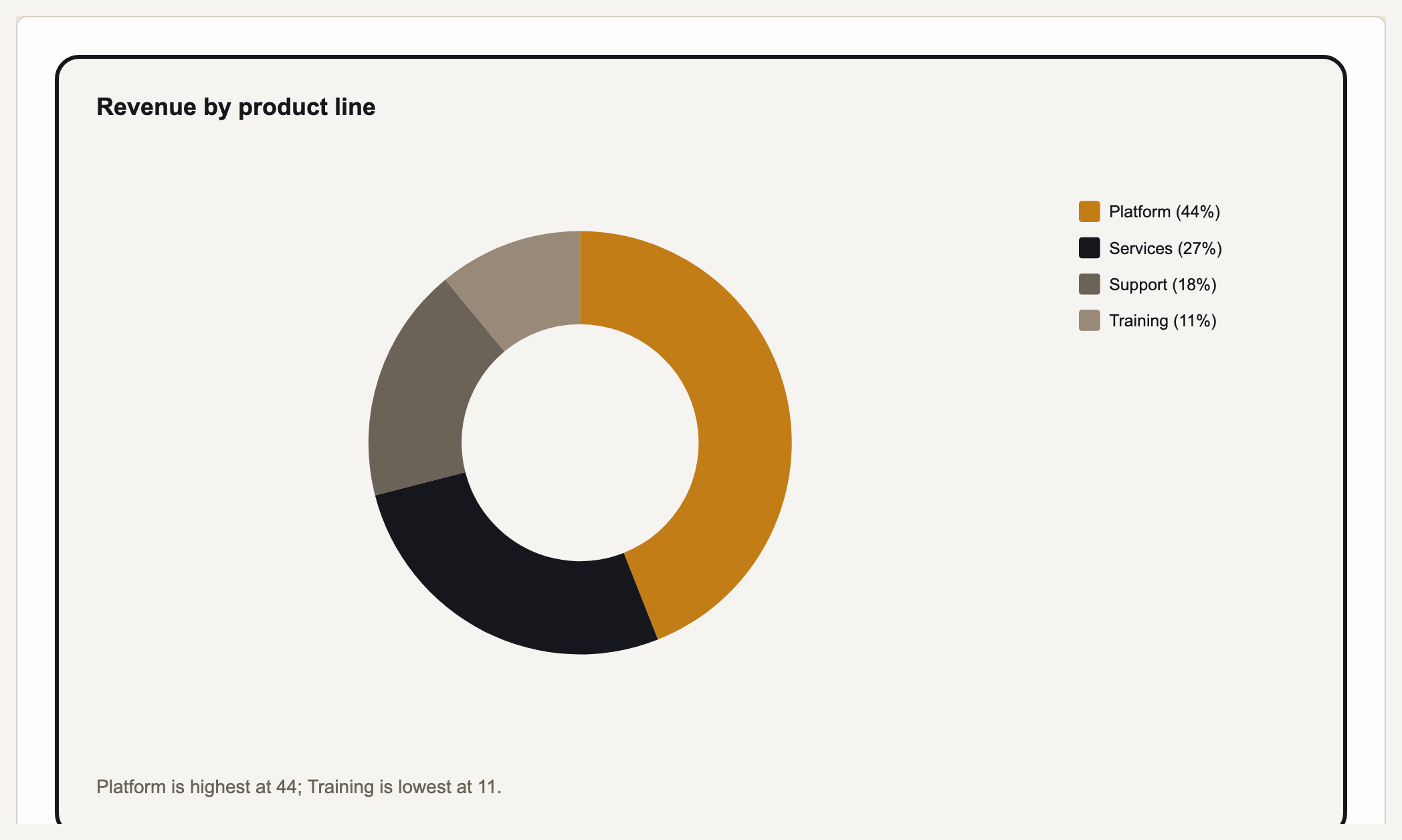
A donut chart (also spelled doughnut, and sometimes called a ring chart) shows parts of a whole as arcs around a ring, with a hollow center. Prism renders the ring and its labels; the center is left transparent, so you can drop a headline number over it in your deck or doc. Gixo Prism's donut chart maker is deterministic — no AI image model in the loop. Paste your values or percentages and Prism renders each segment to exact proportion in clean SVG. The number you enter is the number that appears: drawn from accepted values, with display precision set by the chart controls.
A real Gixo Prism donut chart — segment sizes are your figures, not an approximation.
What makes a donut chart maker trustworthy?
The arcs have to match your data — not an AI's approximation of it.
Paste your values or percentages and Prism renders each arc to exact proportion — deterministic SVG, drawn from the accepted values; display labels can round according to their settings.
The hollow middle isn't just style — use it for the total, a headline percentage, or a short label, so the ring reads at a glance.
Four theme presets — conservative, bold, brand-conservative (default), and brand-bold — plus your own Brand Kit, applied consistently across every segment.
Adjust a value, rename a segment, or switch the theme and the donut re-renders exactly. Export as clean, self-contained HTML/SVG for your deck, doc, or page.
Same maker, same exactness: bar in three variants, line, area, pie, scatter, radar, waterfall, funnel, Gantt, combo, heatmap, treemap, and symbol-map charts are one click away when the data calls for a different shape.
Donut and pie share the same data — flip between them to see which reads better, without re-entering a single number.
Donut chart vs. pie chart: when to use which
Both show parts of a whole. The difference is the hole — and what you do with it.
| Consideration | Donut chart | Pie chart |
|---|---|---|
| Center space | Hollow — room for a total, a KPI, or a label | Solid — no space for a headline number |
| Reads best for | A few segments where you want a focal total | A few segments, simple part-to-whole |
| Comparing segment sizes | Slightly harder — arcs, not full wedges | Slightly easier — full wedges from the center |
| Many small categories | Gets cluttered — a bar chart usually reads better | Gets cluttered — a bar chart usually reads better |
How do you make a donut chart with Gixo Prism?
Bring your data as-is — a label and a number for each segment of the ring.
Deterministic SVG output, each arc sized to exact proportion — no AI model guessing at your values.
Pick a preset or use your Brand Kit so the chart matches your deck or page.
Clean, self-contained output ready to drop into a deck, doc, or page.
Frequently Asked Questions
Explore the Prism chart toolkit
Updated