
AI Pie Chart Generator
Make a pie chart online from a CSV or a list of values. Prism calculates every percentage, sizes every slice, and keeps the labels and colors together — no manual angle math or mismatched legend.
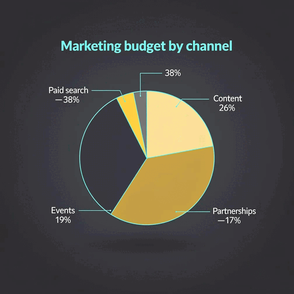
A pie chart — also called a pie graph or circle graph — shows how categories contribute to one complete total. Gixo Prism's pie chart maker calculates those shares directly from your CSV or values and renders the slices deterministically, so the percentages, angles, labels, and legend come from the same data. The same values can also render as a donut chart when a ring reads better than a full circle.
A pie chart maker that gets the percentages right
A reliable pie chart maker online should compute the split from your data rather than draw an approximation. Prism renders the chart deterministically, with no AI image step where a slice or label could come out wrong.
Paste a CSV or type your numbers. Prism calculates each slice's share and renders it to SVG exactly — no rounding by eye, no invented figures.
Every slice color is generated together with its legend entry, so the two are always in sync — no squinting to figure out which color is which.
Prism applies your brand palette across the slices, so a pie chart in a report looks like it came from the same team as everything around it.
Change a value or a label and Prism recalculates every percentage instantly. Export as self-contained HTML/SVG, sharp at any size.
Same data, same exact percentages — pick a donut instead of a full pie when a ring reads better on the page.
How to make a pie chart with the AI pie chart generator
To create a pie chart online, start with a verified part-to-whole dataset. Prism takes it to a finished, on-brand chart in five steps.
Confirm that the categories are non-overlapping parts of one total. A budget split works; independent survey answers that can total more than 100% do not.
Drop in a CSV or type one category and one nonnegative value per row. Keep the same unit across the series.
The pie graph maker divides every value by the total, calculates its percentage, and renders the corresponding SVG angle. Labels and legend colors stay attached to the same category.
Choose a preset or your Brand Kit, use a short descriptive title, and make sure every category can be identified without relying on color alone.
Compare the result with the source values, then export clean HTML/SVG for a deck, document, or web page. The chart stays sharp at any size.
How pie chart percentages and angles are calculated
A trustworthy percentage pie chart starts with one denominator. Prism performs the calculation automatically, but the math should still be easy to audit.
To calculate a slice's percentage, divide its category value by the total of all category values, then multiply by 100. To calculate the slice angle, use the same fraction and multiply by 360 degrees. If you start with a percentage, multiply it by 3.6 to get the angle.
Slice angle = (category value ÷ total value) × 360°
For example, suppose a $100,000 marketing budget is divided across four channels. The category values, percentages, and angles reconcile to one complete whole:
| Budget category | Value | Percentage | Slice angle |
|---|---|---|---|
| Search advertising | $40,000 | 40% | 144° |
| Events | $25,000 | 25% | 90° |
| Content | $20,000 | 20% | 72° |
| Partners | $15,000 | 15% | 54° |
| Total | $100,000 | 100% | 360° |
Displayed percentages can occasionally add to 99% or 101% when every slice is rounded independently. Keep the precise source values, apply one consistent display rule, and treat a rounding difference separately from an incorrect total.
Pie chart examples with explanation and reusable templates
The best pie chart examples answer a single composition question. These patterns help you make your own pie chart without forcing unsuitable data into a circle.
| Pie chart template | Good example | Why it works | Include in the labels |
|---|---|---|---|
| Budget allocation | Annual marketing spend by channel | Every amount uses the same currency and contributes to one fixed budget. | Channel, percentage, period, and total budget |
| Revenue share snapshot | Current-quarter revenue by product | Each product contributes a non-overlapping share of revenue for one stated period. | Product, percentage, currency, and quarter |
| Single-choice survey | Primary purchase reason selected by each respondent | Every person selects one answer, so the responses partition the sample. | Answer, percentage, response count, and sample size |
| Resource allocation | Project hours assigned by workstream | All hours use the same unit and add to one approved capacity total. | Workstream, percentage, hours, and project period |
A multiple-response survey is a useful counterexample: if one respondent can select email, chat, and phone, those rates can exceed 100% and do not form one pie. Use a bar chart for independent response rates. Likewise, avoid multiple pies for a time series; a line graph or grouped bar chart makes change easier to compare.
When should you use a pie chart or circle graph?
Use a pie chart for a simple part-to-whole message, not merely because the data contains percentages.
Use a pie chart when
- Every category contributes to one clearly defined total.
- Categories are mutually exclusive and collectively cover the whole.
- There are a few meaningful slices — often three to six.
- The main message is composition or one visibly dominant share.
- Values are nonnegative and use the same unit.
Choose another chart when
- You need to compare close values precisely.
- There are many categories or several very small slices.
- The data shows change over time.
- Categories overlap or percentages exceed 100%.
- Values include positives and negatives.
The main advantage of pie charts is fast recognition of a few shares within a familiar whole. Their disadvantage is that readers compare angles and areas less precisely than aligned bar lengths. Those pie chart pros and cons are why a labeled pie is useful for a simple composition, while Prism's AI bar chart maker is a better owner for precise category comparisons and its line graph maker is better for trends.
Pie chart colors, labels, and accessibility
A good pie chart color palette separates categories without making color carry the entire meaning.
The best colors for pie charts have sufficient contrast against the background and remain distinguishable for readers with color-vision differences. Use a restrained pie chart color scheme, preserve the same category-to-color mapping throughout a report, and avoid decorative gradients or 3D shading that can distort the apparent size of a slice.
Label slices directly when space allows. A useful label combines the category and percentage; add the raw value when readers need precision. A clear title should identify the whole, population, and period — for example, “Marketing budget by channel, FY2026” is more informative than “Budget.”
For accessible pie chart data visualization, do not rely on color alone. Keep the legend adjacent to the chart, provide a text summary of the main finding, and include the source data as a table when exact values matter. Before publishing, use this checklist:
- Can you state the whole in one sentence?
- Do the category values reconcile with the total?
- Do displayed percentages reconcile to 100%, allowing only for disclosed rounding?
- Can every slice be identified by a label, not color alone?
- Would a bar or line chart communicate the comparison more accurately?
Frequently Asked Questions
Explore the Prism visual toolkit
Updated