
Line Graph and Line Chart Maker
Use this online line graph maker to paste a CSV or enter your numbers and plot every point exactly as supplied. Create a single, double, or multiple line graph without dragging points into place or asking an image model to guess at your data.
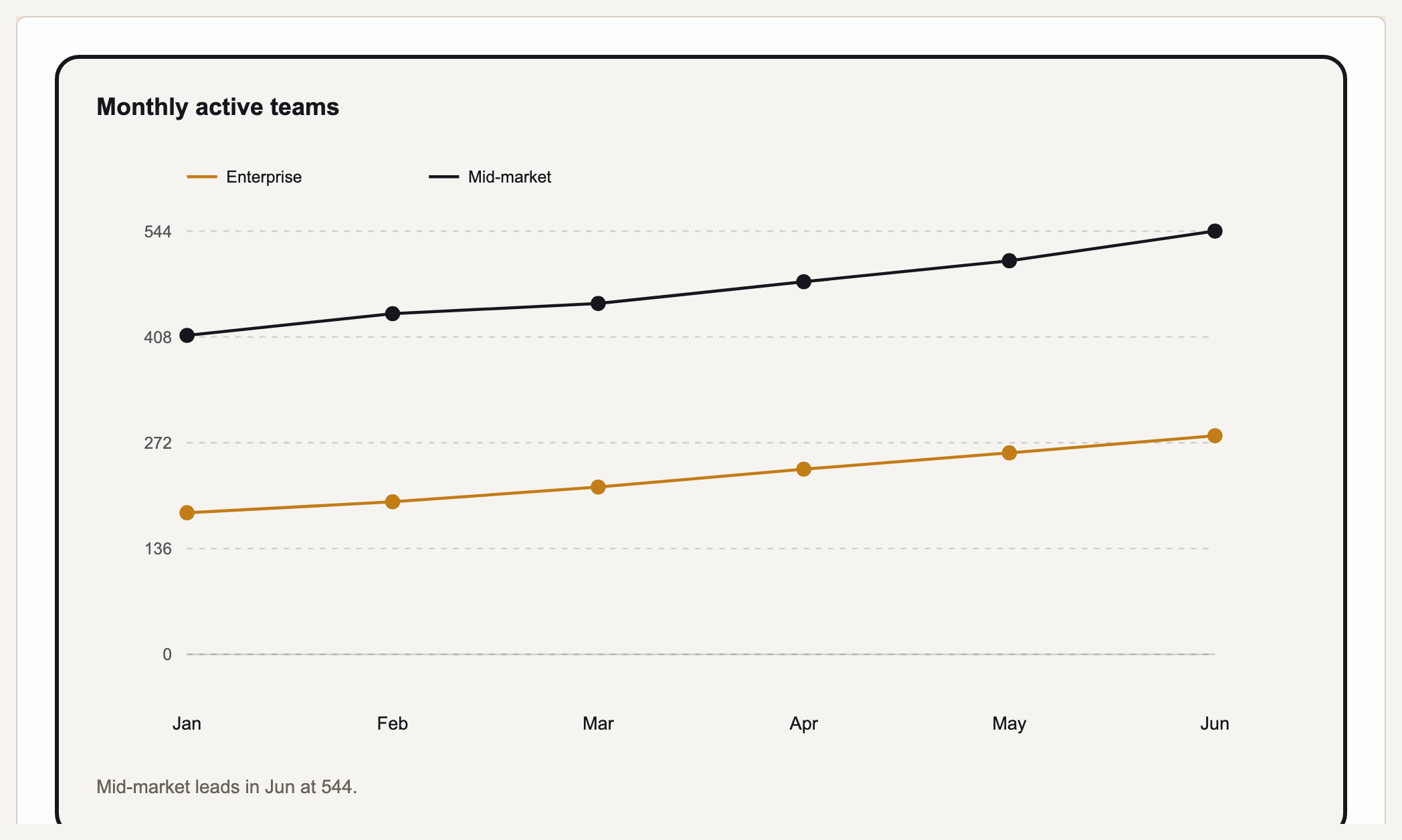
What is a line graph? A line graph, also called a line chart, plots observations in a meaningful order—usually time—and connects consecutive points so direction, magnitude, variability, and comparisons are easier to see. Prism is a deterministic line graph creator: paste a CSV or type the ordered labels and values, and it renders exact single-, double-, or multi-line SVG rather than approximating the trend with an image model.
A real Gixo Prism line graph. The points are the values you supply.
What makes a line graph maker trustworthy?
A line graph maker online must preserve your observations, their order, and the scale that gives the trend its meaning—not merely draw a plausible-looking line.
Paste a CSV or type your numbers and Prism plots each point to scale from the real values — deterministic SVG, drawn from the accepted points, with display precision and missing values to review.
Plot one series, compare two lines, or track several at once — Prism renders each series as its own line so you can read trends side by side.
Line graphs are for values over time or an ordered sequence. Prism scales the axis to your range automatically — no manual tick fiddling to make the trend read correctly.
Four theme presets — conservative, bold, brand-conservative (default), and brand-bold — plus your own Brand Kit, applied consistently across every line and marker.
Adjust the data, labels, or theme and the graph re-renders exactly. Export as clean, self-contained HTML/SVG for your deck, doc, or page.
Same maker, same exactness: bar in three variants, area, pie, donut, scatter, radar, waterfall, funnel, Gantt, combo, heatmap, treemap, and symbol-map charts are one click away when the data calls for a different shape.
How to make a line graph from data step by step
State the measured outcome, the ordered sequence, and the comparison. “How did weekly signups change during the quarter?” is clearer than “Make a graph of signups.”
Put dates or another ordered variable in the first column and one or more numeric series in the next columns. Confirm the units, interval order, missing entries, and whether each value is a count, rate, percentage, or average.
Use the horizontal x-axis for time or the ordered input. Use the vertical y-axis for the measured outcome, with a clear unit and equal numeric intervals.
Bring the checked table into Prism. One value column creates a single line; two creates a double line graph; additional comparable columns create multiple lines.
Prism plots the exact values and scales the chart automatically. Check that the range reveals meaningful change without making a small difference look larger than it is.
Use a title that says what was measured and when. Keep units visible, identify each line directly where possible, and annotate only events that help the reader interpret the pattern.
Verify point order, missing periods, labels, and contrast; apply a preset or Brand Kit; then export the editable result as self-contained HTML/SVG.
Single line vs. double line graph and multi-line graphs
A single-line graph tracks one measured series over a continuous or ordered x-axis: monthly revenue, weekly signups, hourly temperature, or progress across repeated assessments. It keeps one trend central and makes rises, falls, plateaus, and sudden changes easy to inspect.
A double line graph puts exactly two comparable series on the same axes—this year versus last year, plan versus actual, or two locations measured on the same dates. A multiple line graph adds more comparable series, but clarity usually drops after three or four. If a line graph with multiple lines becomes crowded, use several small charts with identical scales instead.
Every line must share the same ordered intervals, unit, and analytical purpose. Do not place revenue, conversion rate, and headcount on one scale merely because all three are numeric. Prism accepts one or several value columns, so the number of lines follows the structure of the checked data rather than a different drawing workflow.
What is a line graph? Line graph examples and how to read them
Single-line example: weekly active users
This example asks one question: how did weekly active users change during a six-week launch period? The weeks are ordered and the measurement has one consistent unit, so connecting consecutive observations is meaningful.
| Week | Weekly active users | What to notice |
|---|---|---|
| 1 | 240 | Starting observation |
| 2 | 265 | Increase of 25 |
| 3 | 258 | Small temporary decline |
| 4 | 310 | Largest week-to-week increase |
| 5 | 344 | Growth continues |
| 6 | 371 | Ends 131 above week 1 |
The responsible reading is that the series rises overall despite a small decline in week 3, with the largest increase between weeks 3 and 4. The graph does not prove what caused the increase; that requires campaign, product, and audience evidence outside the line itself.
Double-line example: plan versus actual signups
A double line graph reveals both the direction of each series and the changing gap between them. Here, the two lines use the same weeks and the same signup unit.
| Week | Planned signups | Actual signups | Comparison |
|---|---|---|---|
| 1 | 100 | 90 | Actual is 10 below plan |
| 2 | 120 | 125 | Actual crosses above plan |
| 3 | 140 | 132 | Actual returns below plan |
| 4 | 160 | 170 | Actual is 10 above plan |
| 5 | 180 | 176 | Actual finishes 4 below plan |
The useful story is not simply that both lines rise. Actual performance crosses the plan twice and finishes close to target. These worked line graph examples show why direction, magnitude, variability, gaps, and crossovers should be described before causes are proposed.
Choose the x-axis, y-axis, intervals, and scale
Use the x-axis for ordered input
Place time, distance, age, experiment stage, or another inherently ordered variable from left to right. Equal time intervals should receive equal visual spacing; irregular dates should preserve their real gaps when elapsed time matters.
Use the y-axis for one measured unit
Label the outcome and its unit—revenue, users, degrees Celsius, percentage, or another consistent measure. Use equal numeric increments throughout the axis and keep unrelated units in separate charts.
Select an honest range
A zero baseline is often useful for counts, but it is not compulsory for every line chart. A narrower range can reveal small variation when all tick values remain visible and the presentation does not exaggerate practical significance.
Show missing observations honestly
Missing is not zero. Preserve the empty period and, where possible, show a visible gap or explanatory note. If a value is estimated, distinguish it from an observed point rather than presenting it as a direct measurement.
How to choose a line graph template
A useful line graph template standardizes the structure without forcing every dataset into the same range. It should provide a descriptive title, an ordered x-axis, an evenly scaled y-axis, visible units, readable line labels, and space for a source or contextual note. A reusable line chart template should still let the axis minimum, maximum, and interval change with the data.
Choose a single-line template when one outcome is the focus. Choose a double-line layout for two directly comparable groups or periods. Use a multi line graph only when the series share the same dates and unit and the reader genuinely needs to compare all of them at once.
- For reports: use direct labels, restrained gridlines, and enough width for dates to remain readable.
- For presentations: emphasize the focal series and keep the takeaway legible from a distance.
- For accessibility: combine color with line style or markers, maintain strong contrast, and provide a concise text description of the main finding.
- For editing: keep the source table available so dates, values, labels, and the selected range can be checked later.
Prism works as both a line chart maker and line graph generator: paste the prepared table, choose the line chart, inspect the scale and labels, apply the appropriate theme, and export the editable HTML/SVG.
Common line graph mistakes and better alternatives
Unordered categories
A line implies meaningful movement between adjacent positions. For products, departments, or favorite colors without an inherent order, use a bar chart instead.
Unequal intervals shown equally
Giving a one-day gap and a three-month gap the same width changes the apparent rate of change. Preserve actual spacing or aggregate to a consistent interval.
Too many overlapping lines
Eight lines may contain the data but hide the message. Highlight the focal series, filter the view, or use small multiples with identical axes.
Trend treated as cause or forecast
A historical line describes observed movement. It does not prove why the values changed or guarantee that the pattern will continue.
Line graph vs. bar graph
Use a line graph when the x-axis is continuous or sequential and the connection between observations matters. Use a bar graph when the goal is to compare separate categories. Use a scatter plot when each mark is an independent x-y pair and the question concerns association rather than change through an ordered sequence. Use an area chart when cumulative magnitude or part-to-whole change is more important than reading the exact path of several lines.
To create a line graph online with Prism, keep the ordered variable in the first column, add one or more comparable numeric columns, and review the resulting SVG against the source table. That workflow lets an online line graph maker automate drawing without automating away analytical judgment.
Frequently Asked Questions
Explore the Prism chart toolkit
Updated