
Gixo Prism · Visual guide
Types of Charts
There are roughly a dozen chart types that do real work in business documents, and each answers one shape of question: comparison across categories, change over time, part against whole, relationship between two measures, or composition of a hierarchy. Picking the type is a matter of matching the question, not of variety. The table below maps every common type to the question it answers and the situation where it misleads.
Last reviewed: August 2026
A current Prism output
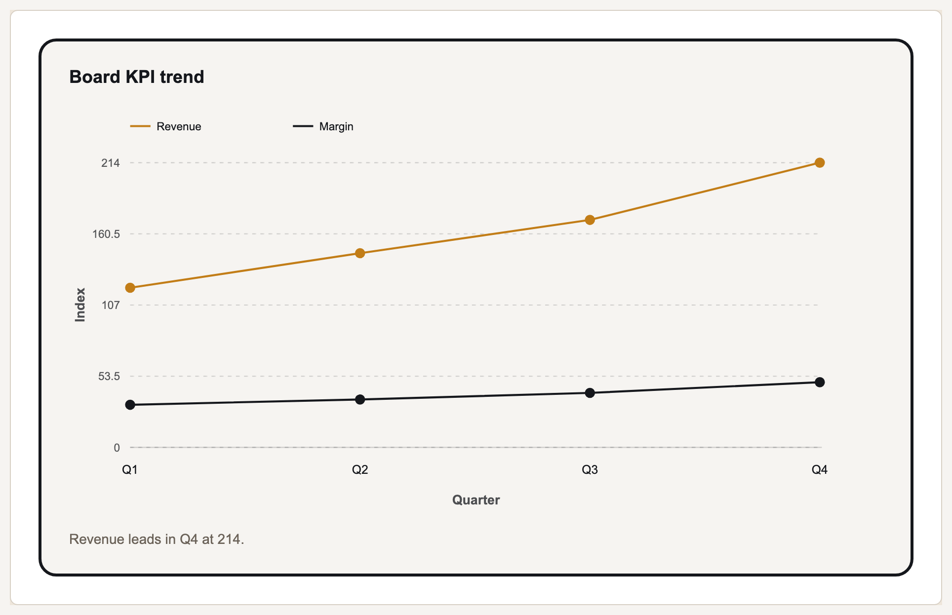
This is a current deterministic Prism render, generated from structured values and labels rather than an image mockup.
The five questions charts answer
Almost every business chart is answering one of five questions. Which category is biggest. How something changed over time. What share one part is of the whole. Whether two measures move together. How a total is composed. Naming the question first collapses a long list of chart types into two or three candidates.
The types that get overused are the ones that look sophisticated rather than the ones that read accurately. Pie charts with nine slices, radar charts comparing entities on incommensurable axes, and 3D anything are the usual offenders — each is harder to read than the plain bar chart it replaced.
The types that get underused are the waterfall and the dot plot. A waterfall is the correct chart whenever the point is how a number got from one value to another, which in finance and operations is a very common question, and it is almost always drawn as an unhelpful stacked bar instead.
Chart types and what each answers
| Chart | Answers | Avoid when |
|---|---|---|
| Bar / column | Which category is biggest | Categories have a natural order and the trend matters more |
| Horizontal bar | Same, with long category labels | There are only two or three categories |
| Stacked bar | Composition within each category | The reader must compare the middle segments |
| Line | How a measure changed over time | The x axis is categorical, not ordered |
| Area | Change over time with volume emphasised | Several series overlap and hide each other |
| Pie / donut | One share of a whole | More than about five slices |
| Scatter | Whether two measures relate | You have very few points |
| Radar | Profile across several rated dimensions | Axes are in different units |
| Waterfall | How a total was built up | There is no meaningful start and end value |
| Funnel | Drop-off through ordered stages | Stages are not genuinely sequential |
| Gantt | What runs when, and overlaps | Only a handful of dates matter |
| Heatmap | Magnitude across two dimensions | Precise values matter more than pattern |
| Treemap | Composition of a hierarchy | You need exact comparison between items |
| Combo / dual axis | Two related measures in different units | The two series have no genuine relationship |
Choosing between close alternatives
Bar or pie
Bar, unless the sentence is literally about one part of one whole. Bars encode length, which is read accurately; pies encode angle, which is not.
Line or bar for time
Line when the reader should see the shape of the trend, bar when they should compare individual periods. Both are defensible; mixing them in one deck is not.
Stacked bar or grouped bar
Grouped when the reader compares series against each other, stacked when the composition of each column is the point. Stacked bars make middle segments nearly impossible to compare.
Treemap or bar
Treemap only for rough composition of many items. If your sentence includes a rank or a precise multiple, use a bar chart.
Charts and graphs: are they different types?
In business use the two words name the same objects. A bar graph and a bar chart are the same drawing, and nobody has ever been misled by which word was on the slide. The distinction that does exist is one of origin rather than practice: graph comes from plotting a relationship on axes, which is why line, bar and scatter attract the word most, while chart covers any graphical representation at all, including gantts, org charts and maps that have no axes to plot against.
The practical consequence is that the word tells you nothing about which one to pick. The choice is made by the question — which category is biggest, how something changed, what share a part is of the whole, whether two measures relate, how a total is composed — and the table above answers it under either name.
There is one place the words genuinely diverge. Graph is also the mathematical term for a network of nodes and edges, which is what a network graph or a knowledge graph means. That is a diagram of relationships rather than a chart of quantities, and it is the single case where reaching for the word should make you check which object you actually mean.
What Gixo Prism does here
Prism's chart maker covers 16 types: bar, horizontal bar and stacked bar, line, area, pie, donut, scatter, radar, waterfall, funnel, gantt, combo, heatmap, treemap and symbol map. Rendering is deterministic — the chart is drawn from your values rather than generated by an image model — and the free maker needs no account.
Types of charts: FAQ
How many types of charts are there?
Dozens exist, but around fourteen do the real work in business documents. Prism renders 16, which covers essentially every chart a report, deck or proposal needs.
What is the most commonly used chart type?
The bar chart, and usually correctly — it encodes value as length, which the eye reads more accurately than angle or area.
When should I use a pie chart?
When the sentence is about one part of a single whole and there are fewer than about five slices. Comparing across two pie charts is the case where a bar chart is almost always better.
What chart shows change over time?
A line chart for the shape of a trend, a bar chart when individual periods are being compared, and a waterfall when the point is how a total moved from one value to another.
What are the different types of charts?
About fourteen do the real work: bar, horizontal bar and stacked bar, line, area, pie and donut, scatter, radar, waterfall, funnel, gantt, heatmap, treemap and combo. Each answers one shape of question, and the table above maps every one of them to it.
What are the different types of charts and graphs?
The same list. In business use the two words name the same objects, so the useful grouping is by question rather than by word: comparison across categories, change over time, part against whole, relationship between two measures, and composition of a hierarchy.
Try the chart types on your own data
The free chart maker renders all 16 types from a pasted table, so you can see which one carries your sentence best.