
Gixo Prism · Visual guide
Types of Infographics
An infographic type is chosen by the shape of the content, not by taste. Statistical infographics carry numbers, informational ones carry concepts, process ones carry steps, timelines carry chronology, comparison ones carry two options side by side, hierarchical ones carry structure, and geographic ones carry place. Matching the type to the content is most of what makes an infographic readable.
Last reviewed: August 2026
A current Prism output
This current Prism output demonstrates one exact, reusable visual module that can sit inside a larger infographic.
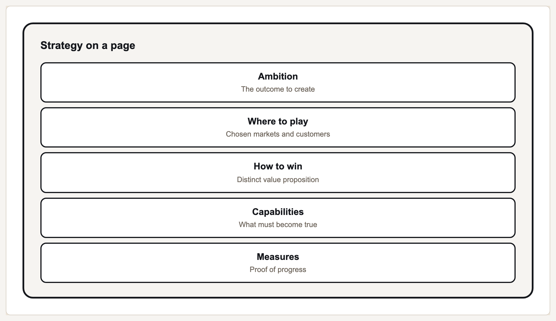
The seven types and what each carries
Infographics fail most often because the type was chosen before the content was understood. A set of statistics forced into a process layout produces steps that do not follow each other; a genuine process rendered as a statistical grid loses the very thing that made it worth showing.
The second common failure is density. An infographic is a summary format: it exists because a reader will not read the report. Packing the report into it defeats the purpose. If a section needs a paragraph of explanation, that section belongs in the document, not the graphic.
The third is decoration outrunning data — the illustrated element that makes the graphic look designed while adding nothing a reader can use. Every element should either encode something or label something.
Infographic types
| Type | Carries | Works when |
|---|---|---|
| Statistical | Numbers and proportions | You have a handful of figures worth remembering |
| Informational | Concepts and definitions | The content is explanatory rather than numeric |
| Process | Ordered steps | The reader needs to follow a sequence |
| Timeline | Chronology | When things happened is the point |
| Comparison | Two or more options side by side | A decision is being made between alternatives |
| Hierarchical | Structure and levels | Containment or ranking matters |
| Geographic | Distribution across place | Location is the variable |
Choosing and building one
Write the takeaway
One sentence a reader should leave with. If there are three takeaways you have three infographics, or a document.
Let the content pick the type
Steps mean process, figures mean statistical, chronology means timeline. Do not pick a layout first and fit content to it.
Cut to what fits
Aim for the number of elements a reader can hold at once — usually five to seven. Everything else belongs in the source document.
Check every element earns its place
Each one should encode a value or label something. Illustration that does neither is the first thing to remove.
Check contrast and colour vision
Infographics get shared as images at small sizes. Low contrast that survives on your monitor will not survive a phone screen.
The informational infographic, and when to reach for it
An informational infographic carries concepts, definitions and explanations rather than figures. It is the type to use when the reader needs to understand something rather than compare quantities: a policy change, a new process, an unfamiliar term, the shape of an argument. Because there is no data to encode, none of the encoding rules apply, and the whole craft moves into segmentation, hierarchy and typography.
That gives it a specific failure mode. A statistical infographic fails by encoding badly; an informational one fails by becoming an article in a picture frame. The discipline is one idea per segment, a segment that fits in roughly twenty-five words, and a single dominant statement carrying the takeaway in plain language. Icons in this type are labels rather than illustration — they help a reader find a segment again, and that is all they are for.
The other common error is forcing figures into it. If the content is genuinely numeric, use a statistical infographic. An informational one that grows a decorative pie chart to look data-driven has invented a comparison the content does not contain, and a reader who tries to read that chart learns nothing from it.
A worked example: an informational infographic for a policy change
The headline is the change in one sentence, and it is the largest element on the graphic. Under it sit three segments, each a short paragraph with an icon: what changes, who it affects, and what to do by when. A footer line carries the effective date and where the full policy lives. Nothing is encoded and nothing is scaled — every element is either the statement, a segment label or a segment. The design work was deciding there are three segments and not seven.
What Gixo Prism does here
Prism composes infographic-style visuals from charts, diagram geometries and stat, quote, callout and definition cards, using your brand palette. Rendering is deterministic, so the figures shown are the figures you supplied rather than an image model's approximation of them — which matters most in exactly this format, where numbers are the content.
Types of infographics: FAQ
What are the main types of infographics?
Statistical, informational, process, timeline, comparison, hierarchical and geographic. The type should follow the shape of the content.
How much content should an infographic hold?
About five to seven elements. It is a summary format; if a point needs a paragraph, it belongs in the document the infographic points at.
What makes an infographic hard to read?
Density and decoration. Too many elements, or elements that look designed without encoding anything, both make the reader work for information they were promised at a glance.
Do infographics need to be illustrated?
No. A clear statistical infographic built from charts and cards outperforms an illustrated one where the illustration carries no information.
What is an informational infographic?
The type that carries concepts, definitions and explanations rather than figures. It suits content a reader needs to understand rather than compare, and its craft is segmentation and hierarchy rather than encoding, because there is nothing numeric to encode.
When should you use an informational infographic?
When the content is explanatory — a policy change, a process, an unfamiliar concept — and there are no quantities worth comparing. If figures are the point, a statistical infographic is the right type instead.
Build the pieces of an infographic
Stat and callout cards, charts and diagrams all render free without an account, and use your own numbers.