
Gixo Prism · Visual guide
Visual Hierarchy
Visual hierarchy is the arrangement of elements so a reader takes them in the order you intend. It is produced by a small set of levers — size, weight, colour and contrast, spacing, and position — and it works by difference: an element reads as important because it differs from its neighbours, not because of any absolute property. The practical consequence is that emphasising everything emphasises nothing.
Last reviewed: August 2026
A current Prism output
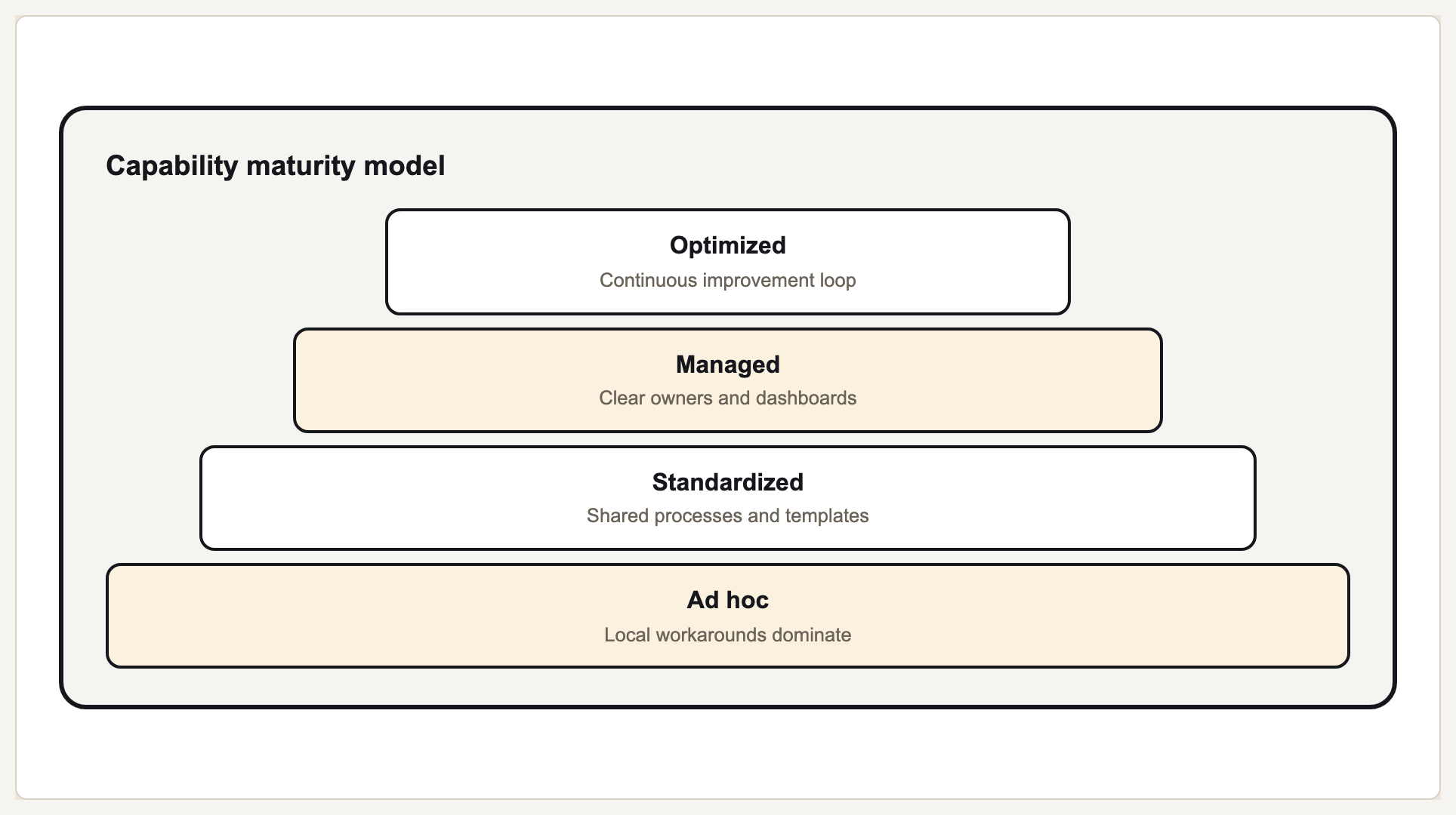
This current Prism output uses size, order, and contrast to make its information hierarchy explicit.
The levers, in order of strength
Size is the strongest lever and the bluntest. A markedly larger element will be read first almost regardless of what else is happening, which is why the takeaway, not the header or logo, should usually be the largest thing on a visual.
Contrast comes next, and it is the one most often lost in production. A hierarchy built in mid-greys on a bright monitor collapses on a projector or a phone in daylight. If the difference between your primary and secondary text is subtle in the design tool, it will be invisible in the room.
Spacing is the most underused. Whitespace around an element isolates it and raises its rank without changing the element at all, and it does so without adding visual noise the way a box or a colour block would.
Position matters least in isolation but interacts with everything: readers of left-to-right scripts start top-left, so an element placed there inherits attention it may not deserve. That is why decorative headers so often steal the entry point from the actual message.
Levers and how to use them
| Lever | Raises rank by | Failure mode |
|---|---|---|
| Size | Making an element markedly larger | Everything scaled up, so nothing dominates |
| Weight | Heavier type or thicker strokes | Bold used for emphasis so often it stops meaning it |
| Colour and contrast | Higher contrast against the background | Subtle greys that vanish on a projector |
| Spacing | Isolating an element with whitespace | Uniform spacing, so grouping reads as a single block |
| Position | Placing at the natural entry point | A decorative header occupying the strongest position |
Testing whether your hierarchy works
Squint at it
Blur until detail is lost. Whatever is still legible is what a scanning reader gets, and it should be the takeaway.
Ask someone where they looked first
Do not explain the design beforehand. The answer is your actual entry point, whatever you intended.
Count the emphasised elements
More than two or three levels and the hierarchy has flattened. Demote until the order is unmistakable.
Check it in the real conditions
Projector, phone, print. Contrast-driven hierarchy is the first thing to break outside the design tool.
Run a contrast check
WCAG thresholds are a floor, not a target, but failing them means part of your audience cannot see the hierarchy at all.
What Gixo Prism does here
Prism applies typographic scale, spacing and brand tokens as part of rendering, so hierarchy stays consistent across a set of visuals rather than being re-established by hand on each one. The free contrast and colour-vision checkers test the two levers most likely to fail outside the design tool.
Visual hierarchy: FAQ
What is visual hierarchy?
The arrangement of elements so a reader takes them in the intended order, created by size, weight, contrast, spacing and position.
What is the strongest way to create hierarchy?
Size. A markedly larger element gets read first almost regardless of context, which is why the takeaway should usually be the largest thing present.
Why does my hierarchy disappear on a projector?
It is probably built on subtle contrast. Mid-grey differences that read clearly on a bright monitor collapse on a projector or a phone outdoors.
How many levels of hierarchy should a visual have?
Two or three. Beyond that the levels stop being distinguishable and the hierarchy flattens into uniform emphasis.