
Gixo Prism · Visual guide
Area Chart
An area chart is a line chart with the region beneath the line filled, used when the volume under the curve matters as well as its shape. The fill is the whole difference: it emphasises magnitude and cumulative total, and it costs you the ability to overlay several series clearly, because filled regions hide one another. Use one series, or stack them deliberately and accept that only the bottom band is easy to read.
Last reviewed: August 2026
A current Prism output
This is a current deterministic Prism render, generated from structured values and labels rather than an image mockup.
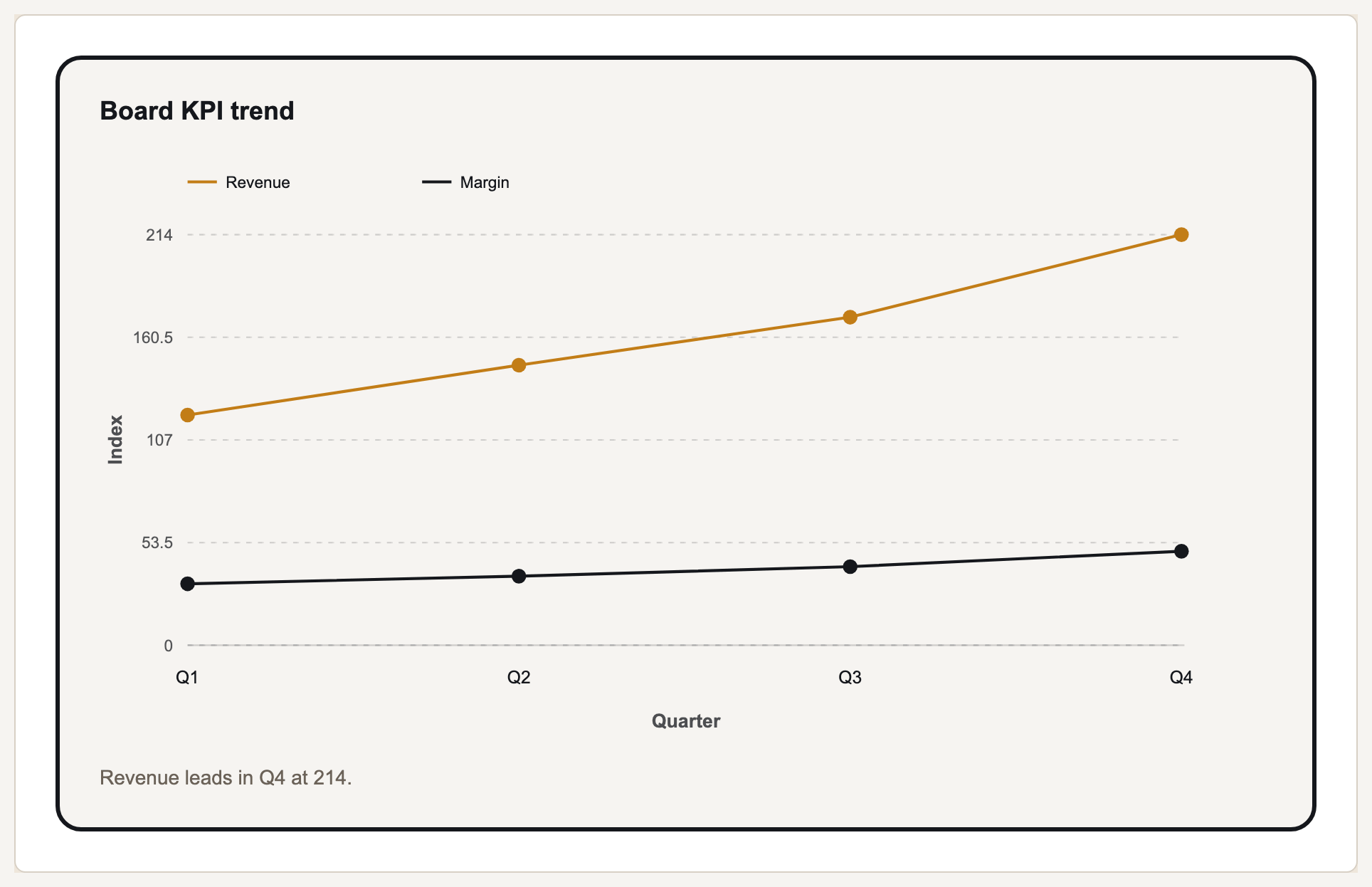
Area against line, and the stacking trap
For a single series, the choice between line and area is mostly emphasis. A line says 'watch the shape'; an area says 'notice how much'. If the quantity beneath the curve has real meaning — volume, spend, headcount — the fill helps. If the point is a rate or a ratio, the fill implies an accumulation that is not there.
With several series, overlapping areas obscure each other. Semi-transparency helps a little and fails as soon as three series cross. If you need to compare several trends, a multi-line chart is almost always the better instrument.
Stacked area charts carry a specific and well-known reading problem: only the bottom band sits on a flat baseline. Every band above it is displaced by the ones below, so its shape reflects the sum of everything underneath as much as its own values. Readers routinely misjudge the middle bands. Stack only when the total is the story and the individual bands are secondary.
When each is right
| Situation | Use | Why |
|---|---|---|
| One series, magnitude matters | Area | The fill communicates volume as well as trend |
| One series, rate or ratio | Line | A fill implies accumulation that a rate does not have |
| Several series compared | Line | Filled regions hide each other |
| Composition of a total over time | Stacked area | The total is the story; accept that middle bands read poorly |
| Few time periods | Bar | With under about six points a line implies continuity you do not have |
Building an area chart that reads correctly
Start the value axis at zero
An area chart encodes magnitude by filled region. Truncating the baseline distorts the very thing the fill is there to show.
Limit to one series, or stack on purpose
Two overlapping filled series is usually the worst of both options — neither clearly comparable nor cleanly totalled.
Order stacked bands deliberately
Put the largest or most stable band at the bottom, since the bottom band is the only one with a flat baseline.
Label the total if the total is the point
If you stacked because the total matters, the reader should not have to add bands by eye.
Area chart vs line chart: the one question that decides it
Ask whether the quantity beneath the curve means anything when it is accumulated. If adding it up across the x axis produces a number somebody would quote — total spend, total hours, cumulative signups — the fill is drawing something real and an area chart is the honest choice. If it does not, because the series is a rate, a ratio, a percentage, an index or a temperature, the fill draws a quantity that does not exist and a line chart is the correct instrument.
The second question is sampling. A fill is continuous, so it claims a measurement between every pair of points. That is true of something recorded continuously and false of weekly survey scores or month-end snapshots, where a line with visible markers admits the gaps that a filled region quietly closes.
Everything else follows from those two. Several series push you toward lines, because filled regions hide each other. And if you need both magnitude and several series, small multiples — the same area chart repeated once per series at one shared scale — beat a single overlapping chart every time.
When to use an area chart
One series where the accumulated quantity is meaningful and worth emphasising. Composition of a total over time, where the total is the story and the individual bands are secondary. A document that gets read at a glance, where a filled region carries magnitude faster than a line does.
When the line chart wins
Rates, ratios, percentages and indices, where accumulation means nothing. More than one series, always. And any case where the reader has to read a precise value at a point, since a fill pulls the eye to the region rather than to the edge that carries the number.
What Gixo Prism does here
Prism renders area charts deterministically, alongside line, bar, stacked bar and combo. Because the renderer draws from your values rather than generating an image, the filled region reflects the numbers you supplied. The free chart maker will render the same table as line, area and stacked bar so you can compare which reads best before committing.
Area chart: FAQ
What is an area chart used for?
Showing how a measure changed over time when the volume under the curve matters as well as the trend — cumulative spend, headcount, or usage.
What is the difference between a line chart and an area chart?
Only the fill. The fill emphasises magnitude and accumulation, and it makes multiple overlapping series hard to read.
Are stacked area charts misleading?
They can be. Only the bottom band has a flat baseline; every band above is displaced by those below, so its apparent shape includes theirs. Use one when the total is the story.
Should an area chart start at zero?
Yes. The filled region encodes magnitude, so a truncated baseline misstates exactly what the chart exists to show.
Area chart vs line chart: which should I use?
Ask whether the quantity under the curve means anything once it is accumulated. If a total across the x axis is a number somebody would quote — spend, hours, signups — use an area chart. If the series is a rate, a ratio or an index, the fill draws a quantity that does not exist and a line is correct.
Is an area chart better than a line chart?
Neither is better in general. The fill buys an emphasis on magnitude and costs the ability to show several series clearly, so an area chart wins for one series where volume matters and loses almost everywhere else.
Compare line, area and stacked on your data
Paste a table into the free chart maker and switch chart types to see which carries the point.