
Gixo Prism · Visual guide
Data Storytelling
Data storytelling is presenting analysis so it produces a decision rather than an impression. In practice it means leading with the finding instead of the method, giving each visual one job, stating what the audience should do about it, and being explicit about what the data does not support. The common failure is narrating charts in the order they were made rather than in the order an argument needs them.
Last reviewed: August 2026
A current Prism output
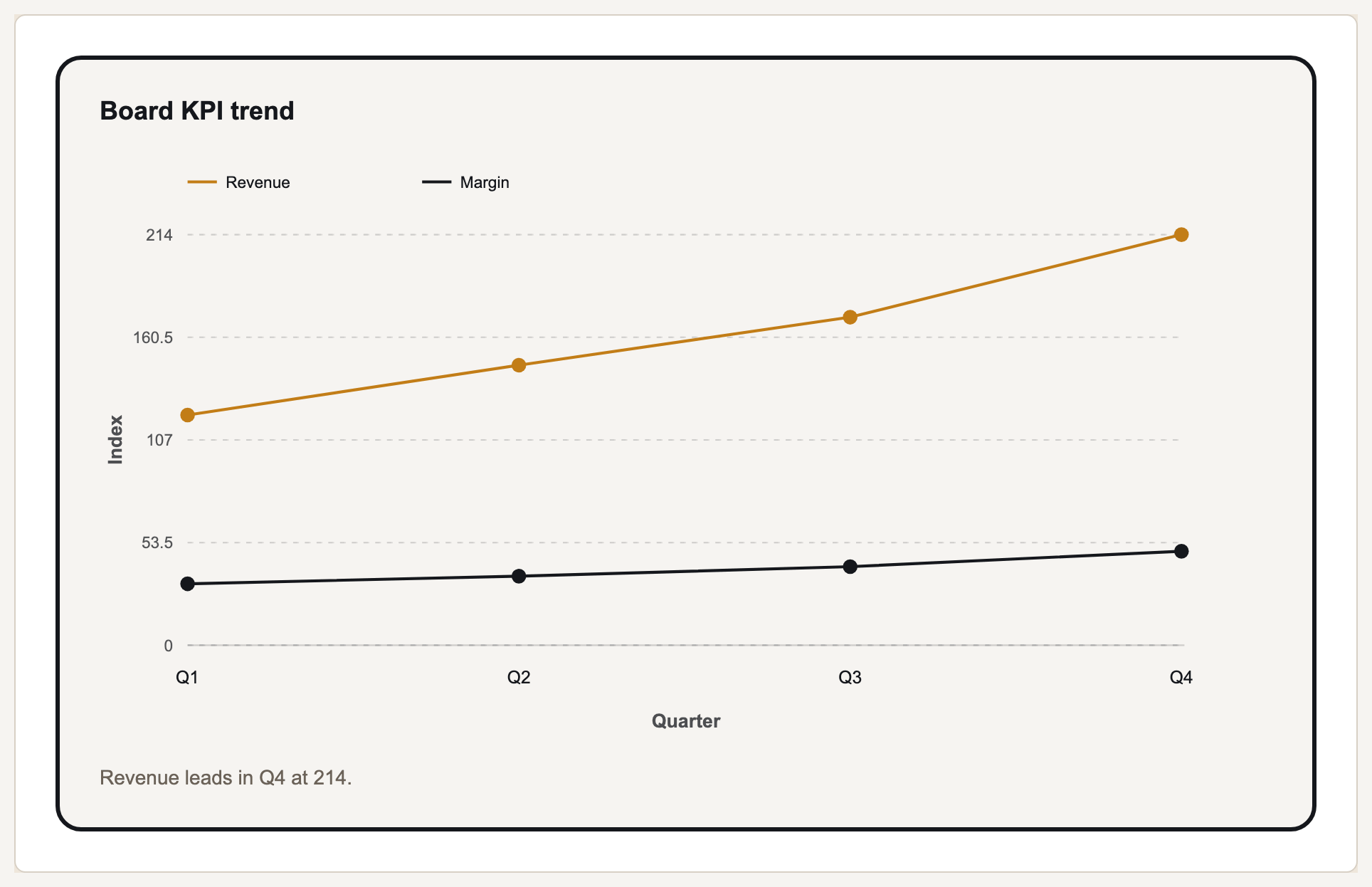
This current Prism output pairs an exact chart with a short, reviewable takeaway rather than inventing a decorative narrative.
Structure beats sequence
Analysis is done in one order and communicated in another. The analyst's order is data, method, findings, conclusion. The decision-maker's order is conclusion, the one or two findings that support it, then method only if challenged. Presenting in analyst order is the single most common reason a good analysis fails to land.
Every visual should have one job, and you should be able to say it as a sentence. If a chart supports two claims, it will make neither cleanly, and if you cannot name its claim at all, it is there because it was made, not because it is needed.
The strongest move available is naming what the data does not show. An audience that has spotted an unaddressed weakness stops listening to the rest; an audience told the limitation up front treats the remaining claims as more credible, not less. This is also where honest work separates itself from advocacy.
Finally, a story needs an ask. Analysis presented without a recommended action puts the synthesis burden back on the audience, and the usual outcome is a request for more analysis rather than a decision.
Two orders, and what each is for
| Element | Analyst order | Decision order |
|---|---|---|
| Opening | Data sources and method | The finding, in one sentence |
| Body | Every analysis performed | The two or three findings that carry the conclusion |
| Charts | In the order they were produced | One per claim, in argument order |
| Caveats | At the end, if at all | Stated up front, briefly |
| Close | Summary of findings | The recommended decision and what it needs |
Building the story
Write the conclusion first
One sentence. If it takes a paragraph, the analysis has not resolved yet and presenting it will not resolve it.
Keep only the evidence that carries it
Two or three findings. Everything else goes in an appendix, where it is available without competing for attention.
Give each visual one sentence
Write the sentence as the chart title. A chart titled 'Revenue by region' is a label; 'EMEA carried Q4 growth' is a claim.
State the limits early
What the data cannot tell you, said briefly and up front. It buys credibility for everything that follows.
End with the ask
The decision you are recommending and what you need to proceed. Analysis without an ask returns as a request for more analysis.
Data storytelling tools, and what they cannot do
Four kinds of tool show up in this work and they do different jobs. Exploration environments — BI and dashboard products, notebooks, spreadsheets — are where the finding is discovered, and they are the wrong place to leave it, because their natural output is every chart you made. Renderers turn a settled figure into the artefact a reader sees. Document and deck tools carry the order. Checkers verify that what is on the chart matches the source it came from.
The questions worth asking when picking one are narrow. Does it draw from your values rather than regenerating them, so a digit cannot drift between the table and the picture. Can the chart title be set to the claim rather than the contents, since that title is the sentence most readers actually take away. Does it export at the size the document needs. And can somebody else re-run it when the figures update, or does the story die with a file on one laptop.
None of them decides anything. The conclusion, the two or three findings that carry it, the order they appear in, the caveats and the ask are judgement, and a tool offering to generate the narrative is generating a plausible one rather than yours. The honest job of a data storytelling tool is to make an argument legible and repeatable, which is real work, and a different thing from having the argument.
What a data storytelling framework is
A framework here is just an agreed order to present in, and the useful one is short: conclusion, the evidence that carries it, the limits, the ask. The table above is that order set against the analyst's order it usually gets confused with. Anything longer tends to be a course syllabus rather than something a team can apply to a Tuesday deck.
What Gixo Prism does here
Prism renders the visuals deterministically from your figures, so the numbers in the story are the numbers in the source — the free chart number checker compares visible figures against the source text, which is the check that matters when an analysis is quoted onward. Prism does not write the argument; the sequencing and the ask stay yours.
Data storytelling: FAQ
What is data storytelling?
Presenting analysis so it produces a decision: leading with the finding, giving each visual one claim, stating the limits, and ending with a recommended action.
How is it different from data visualization?
Visualization is how one chart encodes numbers. Storytelling is the order and framing of several, plus the argument connecting them to a decision.
Should I present my method?
Only if challenged, or briefly up front where a limitation affects how the finding should be read. Leading with method is the most common reason a sound analysis fails to land.
What should a chart title say?
The claim, not the contents. 'EMEA carried Q4 growth' does work that 'Revenue by region' leaves to the reader.
What tools do you need for data storytelling?
An environment to find the result in, something that renders the final visuals from your figures rather than redrawing them, a document or deck to carry the order, and a check that the numbers on the visual match the source. None of them supplies the conclusion, the order or the ask.
What is a data storytelling framework?
An agreed order to present in: the conclusion first, then the two or three findings that carry it, then the limits, then the recommended action. It exists to stop an analysis being presented in the order it happened to be performed.
Check the numbers before you present
The free chart number checker compares the figures on a visual against your source text.