
Gixo Prism · Visual guide
Dual Axis Chart
A dual axis chart plots two series with different units against two separate value axes on one set of axes — revenue in currency on the left, conversion rate as a percentage on the right. It is genuinely useful when two measures share a time axis and a reader needs to see them together. It is also the easiest chart to mislead with, because the person choosing the two axis ranges controls whether the series appear to move together.
Last reviewed: August 2026
A current Prism output
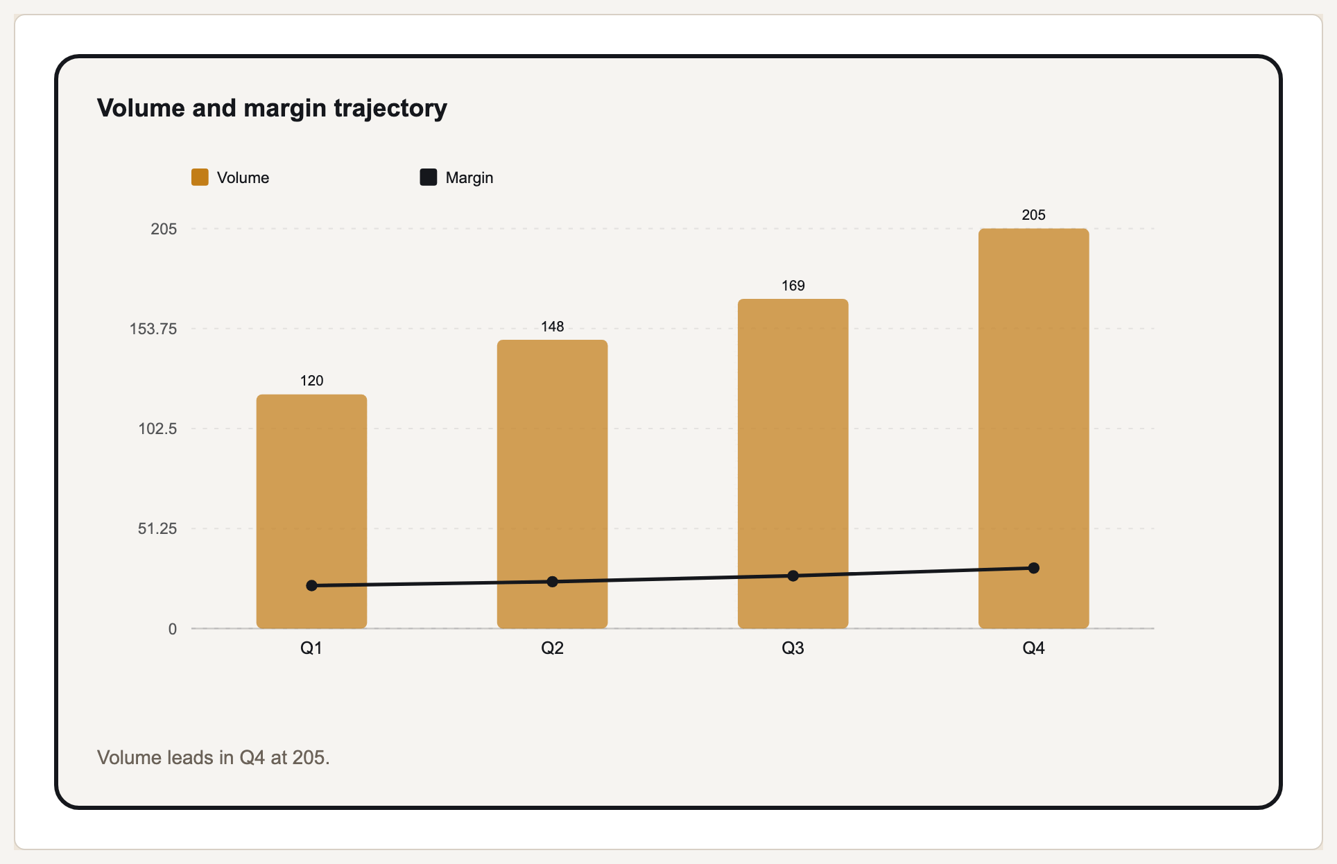
This is a current deterministic chart render. Prism keeps each supplied value and label in the exported SVG.
The problem with the second axis
The apparent relationship between two series on a dual axis chart is a function of two arbitrary choices: where each axis starts and where it ends. Change either range and the lines converge or diverge without a single data point changing. Nothing in the chart tells the reader that the crossing point carries no meaning, which is what makes this format the standard illustration in guides about misleading charts.
This does not make dual axis charts illegitimate. It makes them a format that requires an honest author, because the chart cannot defend itself. If the two series genuinely share a driver and the reader needs both in one frame, it is often the clearest option available.
The safest alternatives are two stacked panels sharing one time axis, which preserves the comparison without implying a specific alignment, and indexing both series to 100 at a base period, which puts them on one axis and makes relative change directly comparable.
Alternatives to a dual axis
| Approach | Keeps | Costs |
|---|---|---|
| Dual axis | Both series in one compact frame | Implies a relationship set by arbitrary axis ranges |
| Two stacked panels, shared x axis | Honest comparison over the same period | More vertical space |
| Index both to 100 at a base date | One axis, directly comparable change | Absolute values are no longer readable |
| Scatter of one against the other | The actual relationship, if that is the question | Loses the time dimension unless points are labelled |
Using one responsibly
Ask whether the relationship is the point
If you are claiming the two move together, a scatter tests that claim honestly. A dual axis only illustrates it.
Label both axes unmistakably
Colour-match each axis to its series. An unlabelled right axis is the most common reason these charts are misread.
Do not tune the ranges for effect
If you adjusted an axis until the lines aligned, you have drawn a conclusion rather than shown one.
Prefer indexing when both are trends
Indexing to a base period puts both on one axis and removes the arbitrary alignment entirely.
What Gixo Prism does here
Prism renders a combo chart, which pairs two series on one frame — typically bars for one measure and a line for another. Rendering is deterministic, so the values are exactly what you supplied; the axis judgement, which is where this chart type goes wrong, stays with you. The free chart honesty checker flags axis choices that exaggerate a difference.
Dual axis chart: FAQ
What is a dual axis chart?
A chart plotting two series against two different value axes on one frame, used when the measures share an x axis but not a unit.
Why are dual axis charts considered misleading?
Because the apparent alignment between the two series depends entirely on the axis ranges the author picked. Change the ranges and the relationship appears to change, with no change in the data.
What should I use instead?
Two panels sharing one time axis, or index both series to 100 at a base period so they can share a single axis. If the relationship itself is the claim, use a scatter plot.
Does Gixo Prism support dual axis charts?
Prism renders a combo chart pairing two series, typically bars and a line. The rendering is deterministic; the axis judgement is yours.
Render a combo chart from your table
The free chart maker draws combo charts deterministically, so the numbers stay yours.