
Gixo Prism · Visual guide
Infographic Design
Infographic design is mostly editing. The decisions that determine whether one works are choosing a single takeaway, establishing a clear reading order, encoding numbers in shapes people read accurately, restricting the palette to what carries meaning, and keeping contrast high enough to survive a phone screen. Illustration quality matters far less than any of these, which is why a plain, well-structured infographic routinely outperforms a beautiful, unstructured one.
Last reviewed: August 2026
A current Prism output
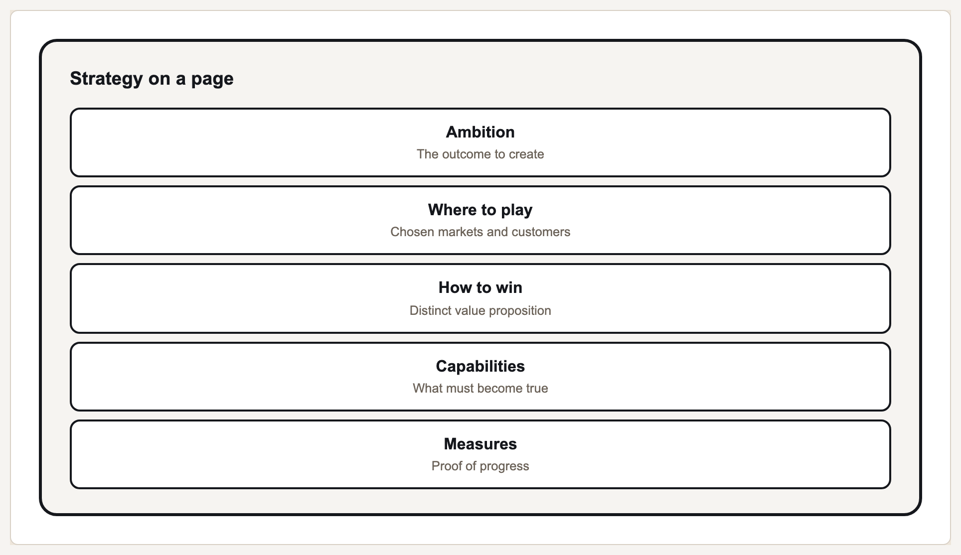
This current Prism output demonstrates one exact, reusable visual module that can sit inside a larger infographic.
What actually decides readability
An infographic exists because someone will not read the document. That gives it one job: deliver a takeaway at a glance. Two takeaways halves the chance of either landing, and the most common design failure is refusing to cut the second, third and fourth.
Reading order is the next lever. A reader's eye needs an obvious entry point and an obvious path. Size, weight and position establish that hierarchy; if every element is emphasised, none is, and the reader lands somewhere arbitrary and works outward.
The encoding choices are the same ones that govern charts, and they matter more here because infographics lean on area and colour — the two encodings people read least accurately. A circle scaled by radius rather than area overstates every increase; a palette with no perceptual ordering turns a quantitative scale into a guessing game.
Finally, infographics circulate as images at small sizes. Type that works at full width becomes unreadable in a feed, and low-contrast greys disappear entirely. Designing for the smallest size it will be seen at is more useful than designing for the artboard.
Design decisions and what each is for
| Decision | Do | Because |
|---|---|---|
| Takeaway | Exactly one, stated in words | A reader who leaves with nothing named leaves with nothing |
| Hierarchy | One dominant element, then supporting | Uniform emphasis gives the eye no entry point |
| Encoding | Prefer length and position to area and colour | Area and colour are read least accurately |
| Palette | Under six colours, each with a meaning | Decorative colour reads as a category that does not exist |
| Type | Two sizes minimum, high contrast | It will be seen small, in a feed |
| Density | Five to seven elements | Beyond that it is a document, not a graphic |
A design pass that catches most problems
Write the takeaway as a sentence
If you cannot, the graphic has no job yet. If you write two, split or cut.
Squint at it
Blur your eyes. What remains legible is what a scrolling reader gets. If that is not the takeaway, the hierarchy is wrong.
Check every number against the source
Infographics are copied by hand more than charts are, and a transposed digit in a shareable format travels far.
Check contrast and colour vision
Run it against WCAG contrast thresholds and simulate the common colour-vision deficiencies. Roughly one in twelve men is affected.
View it at thumbnail size
If the takeaway does not survive at the size it will actually be seen, redesign for that size rather than hoping.
What Gixo Prism does here
Prism composes infographic-style visuals from charts, 11 diagram geometries and stat, quote, callout and definition cards, applying your brand palette automatically. Because rendering is deterministic rather than image-generated, the figures shown are exactly the ones you supplied — which matters most in a format where numbers are the content and get quoted onward. The contrast and colour-vision checkers below cover the last two steps above.
Infographic design: FAQ
What makes a good infographic?
One takeaway, a clear reading order, encodings people read accurately, a restrained palette, and contrast that survives a small screen. Illustration quality is secondary to all of these.
How many colours should an infographic use?
Under six, each carrying meaning. Decorative colour is read as a category, so it invents distinctions that are not in the data.
How much text belongs on an infographic?
Enough to name the takeaway and label the elements. If a point needs a paragraph, it belongs in the document the graphic points at.
What size should an infographic be designed for?
The smallest size it will realistically be seen at. Most are consumed in a feed or a chat thread, not at full width.
Build the pieces, on brand
Stat cards, charts and diagrams render free, deterministically, with your palette applied.