
Gixo Prism · Visual guide
Infographic Layout
Infographic layout is the arrangement that tells a reader where to start and where to go next. Six structures cover nearly everything: single column for a linear narrative, grid for parallel items, timeline for chronology, split for comparison, radial for a central idea with facets, and hub-and-spoke for one topic with independent branches. The layout should be chosen from the content's shape, and then the eye guided through it by size, spacing and alignment.
Last reviewed: August 2026
A current Prism output
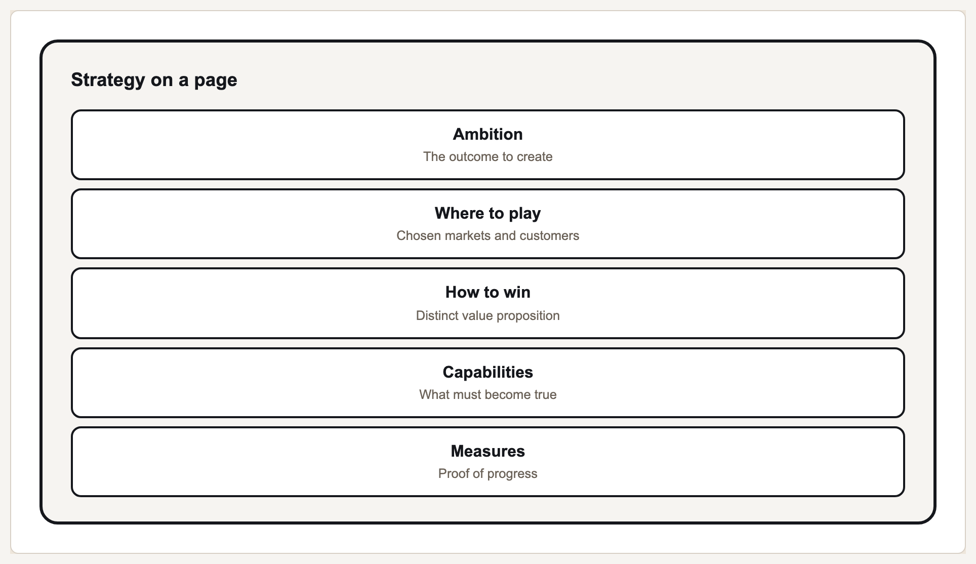
This current Prism output demonstrates one exact, reusable visual module that can sit inside a larger infographic.
Layout is reading order made visible
A reader lands on the largest, highest-contrast element and moves outward. That means layout and hierarchy are the same decision seen from two angles: whatever you make biggest is where the graphic starts, whether or not you intended it as the entry point.
Vertical single-column layouts dominate because most infographics are scrolled on a phone. A layout that depends on side-by-side comparison across a wide canvas breaks when it is rendered at 400 pixels wide, which is where most of its audience will meet it.
Spacing does more work than dividers. Grouping related elements with proximity and separating groups with generous whitespace produces structure without adding lines. Reaching for borders and rules is usually a sign that the spacing has not been resolved.
Layouts and what each suits
| Layout | Suits | Watch for |
|---|---|---|
| Single column | A linear narrative or ranked list | Length; a very long scroll loses readers |
| Grid | Parallel items of equal weight | No entry point if every cell is identical |
| Timeline | Chronology | Uneven intervals drawn evenly, which distorts pace |
| Split / side-by-side | Two options compared | Breaking to a single column on a phone |
| Radial | One centre with facets | Implying a cycle where none exists |
| Hub and spoke | One topic, independent branches | Suggesting the spokes are ordered |
Setting up a layout
Pick the structure from the content
Chronology means timeline, parallel items mean grid, comparison means split. Do not start from a template you liked.
Decide the entry point deliberately
Make one element clearly dominant. It should be the takeaway, not the logo or the decorative header.
Group by proximity before adding lines
Whitespace communicates grouping. Dividers are usually a patch over unresolved spacing.
Align to a grid
Consistent alignment is most of what makes a layout look considered; misalignment reads as carelessness even when nobody can name it.
Test it narrow
Check it at phone width. If a side-by-side comparison collapses into nonsense, the layout is wrong for where it will be seen.
Infographic layout ideas, by the shape of the content
The six structures become concrete once each is attached to a job. A stat column: one headline figure at the top, three or four times the size of anything else, then four supporting figures down a single narrow column with one line of context each. It suits quarterly results and survey findings, and it survives a phone because it was never wider than one column to begin with.
A before-and-after split: two columns carrying the same elements in the same order, so the reader compares across rows instead of hunting. A milestone timeline: one vertical spine with dates on one side and events on the other, drawn to scale or explicitly labelled as unscaled, because evenly spaced uneven intervals misstate the pace of the story. A process ribbon: four to six numbered steps in a single scroll, with arrows only between steps that genuinely follow one another.
A comparison grid: criteria as rows, options as columns, every row the same kind of judgement — a grid that mixes prices, opinions and yes-or-no marks in adjacent rows stops being readable at about the fourth row. A hub card set: one central topic card with four to six satellites and no arrows at all, since arrows would imply an order the content does not have.
Where borrowed layout ideas go wrong
A layout copied from a gallery carries the shape of somebody else's content. If their six items were parallel and yours are sequential, the grid you liked reads as a list with no order and the reader supplies one at random. Take the idea, then test it against your own content's shape before the first element is placed, and check it at phone width, which is where most of the audience will meet it.
What Gixo Prism does here
Prism handles layout constraints and spacing as part of rendering rather than leaving them to manual nudging, so a set of visuals stays consistent across a document instead of drifting element by element. Composition blocks arrange charts, diagram geometries and cards under your brand tokens.
Infographic layout: FAQ
What is the best infographic layout?
The one matching the content's shape: timeline for chronology, grid for parallel items, split for comparison, single column for a narrative.
What size should an infographic be?
Whatever suits its destination, but design for the narrowest realistic width. Most infographics are read on a phone regardless of the canvas they were built on.
How do I guide the reader's eye?
Make one element clearly dominant, group related items by proximity, and align everything to a grid. Size and spacing set reading order more reliably than arrows do.
Should I use dividers between sections?
Usually not. Generous whitespace groups and separates more cleanly, and reaching for rules is often a sign the spacing needs work.
What are some good infographic layout ideas?
A stat column for figures, a before-and-after split for comparison, a milestone timeline for chronology, a process ribbon for ordered steps, a comparison grid for options against criteria, and a hub card set for one topic with independent branches.
Compose a layout from rendered pieces
Cards, charts and diagrams render free and align consistently under one palette.