
Gixo Prism · Visual guide
Pictogram Chart
A pictogram chart, also called an icon array or isotype chart, represents quantity by repeating a symbol — ten person icons for ten thousand people, each icon standing for a fixed unit. It works well for small whole numbers and for risk communication, where showing 3 icons in 100 is more intuitive than saying 3 per cent. It fails when values do not divide neatly into whole icons, because a half-drawn symbol is read far less accurately than a bar.
Last reviewed: August 2026
A current Prism output
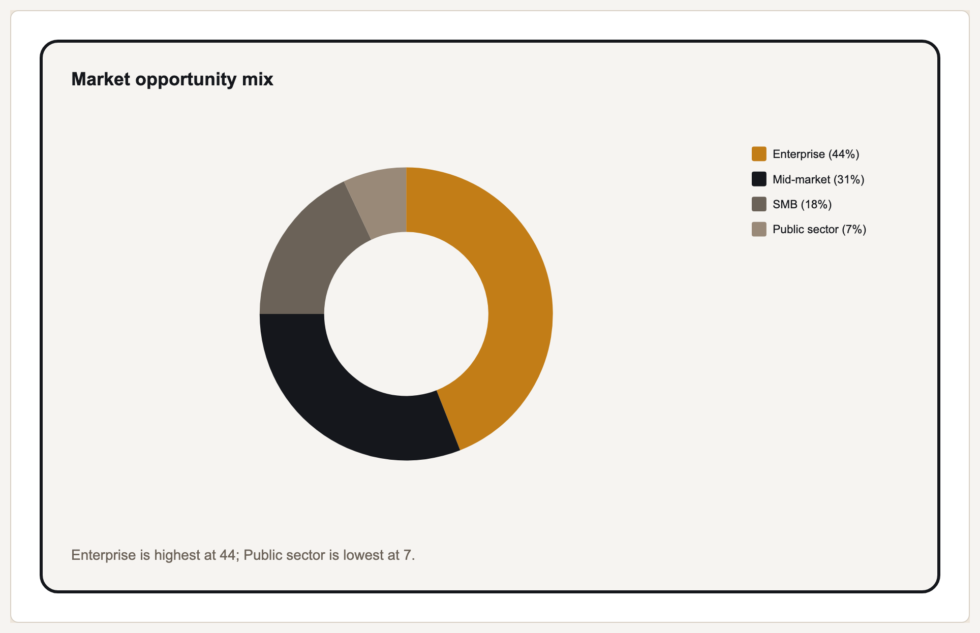
Prism does not claim a pictogram renderer. This current supported chart is shown as an honest alternative when exact quantities matter.
How a pictogram works, and where it breaks
The mechanism is counting rather than measuring. A reader does not judge the length of a pictogram; they count symbols and multiply by the stated unit. That makes the key value the unit itself, and it must be stated explicitly — an icon array without a legend saying what one icon represents is unreadable.
Pictograms are unusually good at risk. Communicating that a treatment affects 3 people in 100 lands far better as 100 icons with 3 highlighted than as the number 3 per cent, and that difference is well established in medical communication. If your point is a small proportion that people routinely misjudge, this is the right format.
The failure mode is fractions. When a value is 2.7 units, the chart must either round — misstating the number — or draw 0.7 of a symbol, which readers judge poorly and inconsistently. If your values do not land near whole units, a bar chart will communicate them more accurately.
A second failure is scaling the icon rather than repeating it. Doubling a symbol's height quadruples its area, so the eye reads a much larger increase than the data contains. Repeat symbols at a constant size; never resize one.
Pictogram against the alternatives
| Situation | Best choice | Why |
|---|---|---|
| Small proportion, general audience | Pictogram | Counting 3 in 100 is more intuitive than 3 per cent |
| Values with awkward fractions | Bar chart | Part-symbols are read inaccurately |
| Many categories to rank | Bar chart | Counting symbols across many rows is slow |
| Change over time | Line chart | Pictograms have no natural time axis |
| One share of a whole, few parts | Pie or pictogram | Both work; pictogram is better for small shares |
Using a pictogram well
State the unit
One icon equals what, exactly. Without this the chart cannot be read at all, and it is the most commonly omitted element.
Repeat, never resize
Constant symbol size. Scaling a single icon encodes value as area and overstates every increase.
Round honestly or change chart
If values do not sit near whole units, either state the rounding plainly or use a bar chart instead of drawing partial symbols.
Keep the symbol legible small
Icon arrays are usually reproduced small. A detailed symbol becomes a smudge; a simple silhouette survives.
What Gixo Prism does here
Prism does not render pictogram charts. Its 16 chart types are bar in three variants, line, area, pie, donut, scatter, radar, waterfall, funnel, gantt, combo, heatmap, treemap and symbol map — icon arrays are not among them. For the proportion-of-a-whole job a pictogram usually does, the free chart maker will render a bar, donut or stacked bar from the same numbers.
Pictogram chart: FAQ
What is a pictogram chart?
A chart that shows quantity by repeating a symbol a set number of times, where each symbol represents a fixed unit. Also called an icon array or isotype chart.
When is a pictogram better than a bar chart?
When communicating a small proportion to a general audience — 3 in 100 highlighted icons is understood more reliably than '3 per cent' — and when values are small whole numbers.
What is the main problem with pictograms?
Fractional values. A partial symbol is read inaccurately, so any value that does not land near a whole unit is either misstated by rounding or rendered ambiguously.
Does Gixo Prism make pictogram charts?
No. Prism renders 16 chart types and an icon array is not one of them. For the same underlying comparison, a bar, donut or stacked bar from the free chart maker will do the job.
Render the same numbers as a chart
The free chart maker covers 16 deterministic chart types from a pasted table, no account needed.