
Gixo Prism · Visual guide
Data Visualization
Data visualization is the practice of encoding numbers as position, length, angle, area or colour so a reader can compare them faster than they could read a table. The choice of encoding is the whole craft: position and length are read accurately, angle and area are read poorly, and colour is read as category rather than quantity. That ordering, not chart variety, is what separates a chart that informs from one that decorates.
Last reviewed: August 2026
A current Prism output
This is a current deterministic Prism render, generated from structured values and labels rather than an image mockup.
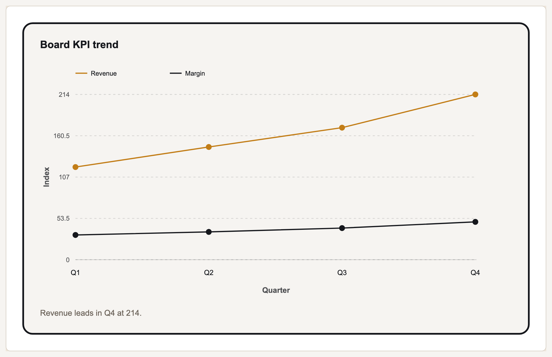
What data visualization actually is
Every chart is a mapping from a number to something the eye can measure. A bar chart maps value to length, a scatter plot maps two values to position, a pie chart maps proportion to angle. Because the eye judges some of these far more accurately than others, the chart type you pick decides how precisely your reader can recover the underlying numbers.
The practical consequence is a ranking. Position along a common scale is judged most accurately, then length, then angle and slope, then area, then colour saturation. This is why a bar chart beats a pie chart for comparing similar values, and why a treemap is a poor choice when the point is a precise ranking rather than a rough sense of composition.
A visualization is not automatically honest because the numbers are correct. A truncated axis exaggerates a difference; an area encoding that scales radius rather than area quadruples an apparent doubling; a dual axis can manufacture a correlation that is not there. These are the failures worth checking for, because each of them survives a proofread of the data.
Chart families and what each is for
| Family | Reads best for | Common mistake |
|---|---|---|
| Bar and column | Comparing values across categories | Truncating the axis so a small gap looks large |
| Line and area | Change over an ordered interval, usually time | Using a line for categories that have no order |
| Pie and donut | One part against the whole, few slices | More than about five slices, or comparing across two pies |
| Scatter | Relationship between two measures | Reading correlation as causation |
| Heatmap | Density or magnitude across two dimensions | A colour scale with no perceptual ordering |
| Treemap | Rough composition of a hierarchy | Expecting precise comparison between rectangles |
| Waterfall | How a total is built up or torn down | Omitting the bridge steps that reconcile the ends |
How to choose a chart
Say the sentence first
Write the one sentence the chart must prove. If you cannot write it, the chart has no job and no chart type will fix that.
Identify the comparison
Across categories, over time, part-to-whole, or relationship between measures. Those four cover most business charts, and each has an obvious family.
Pick the most accurate encoding that fits
Prefer position and length over angle and area. Reach for a pie chart only when the point genuinely is one share of a whole.
Check the axis
Start bars at zero. Lines may be truncated when the point is a rate of change, but say so on the axis rather than leaving the reader to notice.
Check it survives a colour-blind reader
Roughly one in twelve men has a colour-vision deficiency. If the chart is unreadable in deuteranopia, it is unreadable for a chunk of the room.
Types of data visualization, beyond charts
Chart families are one branch of a larger set. A business audience meets five kinds of data visualization in practice: charts, which encode quantity; maps, which encode place; diagrams and network graphs, which encode relationship rather than amount; tables and heat grids, which keep exact values readable while still showing a pattern; and dashboards, which are not really a type at all but an arrangement of several with a monitoring job.
Each fails in its own way. A chart fails when the encoding is one people read inaccurately. A map fails when it shades population rather than rate, so it becomes a picture of where people live. A network graph fails when the layout algorithm's aesthetics get read as meaning, because proximity in a force-directed layout is not a measurement. A table fails when it is asked to carry a comparison the eye cannot make down a column of digits. A dashboard fails when it answers no question in particular, which is most of them.
Choosing between the five is the chart-type question asked one level up. Place belongs on a map only when the geography is the variable rather than just an available column. Relationship belongs in a diagram, whatever the numbers alongside it suggest. Anything a reader will look up rather than compare belongs in a table, and putting it in a chart to make the page look analytical costs them the precision they came for.
What Gixo Prism does here
Prism renders 16 chart types deterministically — bar in three variants, line, area, pie, donut, scatter, radar, waterfall, funnel, gantt, combo, heatmap, treemap and symbol map. Deterministic means the value you enter is the value drawn: no image model redraws or garbles a digit between your table and the SVG. Three of the free checkers below exist specifically for the distortions above.
Data visualization: FAQ
What is data visualization in simple terms?
Turning numbers into shapes the eye can compare. A table makes you read; a chart lets you see a difference in one glance, provided the shape you chose is one people read accurately.
What is the most accurate type of chart?
Anything that encodes value as position on a common scale, which in practice means bar charts and dot plots. Angle and area encodings — pie charts, bubble charts, treemaps — are read least accurately.
Is it ever acceptable to truncate an axis?
On a line chart tracking a rate of change, yes, if the axis is labelled honestly. On a bar chart, no: bars encode value as length, so cutting the baseline directly misstates the ratio between them.
How many colours should a chart use?
As few as carry meaning, usually under six. Beyond that a reader stops decoding the legend and starts guessing, and the palette has to survive colour-vision deficiency as well.
What are the main types of data visualization?
Charts for quantity, maps for place, diagrams and network graphs for relationship, tables and heat grids for exact values that also need to show pattern, and dashboards, which are an arrangement of several rather than a type of their own.
How do you choose between types of data visualization?
Write the sentence the visual has to carry, then pick the family whose encoding carries it: quantity to a chart, place to a map, relationship to a diagram, values a reader will look up to a table. The specific type is chosen inside that family, not before it.
Make a chart from your own numbers
Paste a table into the free chart maker. It renders deterministically to SVG, so the figures stay exactly what you entered.