
Radar Chart Maker
Paste your criteria and scores and get an exact radar chart — every axis plotted to the value you entered.
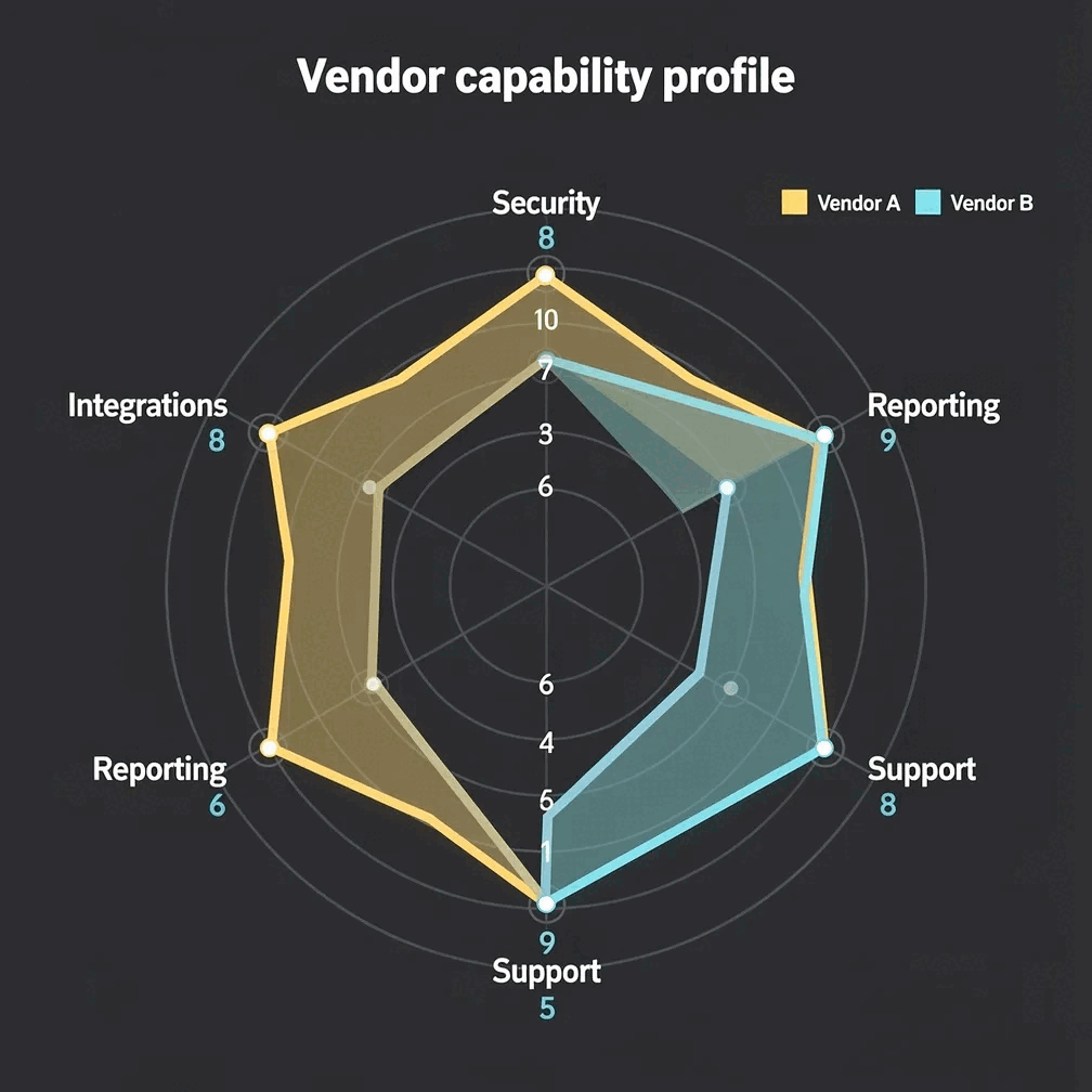
A radar chart — also called a spider chart or a web chart — plots several measures on axes radiating from a common centre, then joins the points into a shape. It is the right chart when you are comparing a small number of entities across the same set of criteria: two vendors on eight evaluation dimensions, three candidates on the same scorecard, this quarter's capability profile against last quarter's.
What makes a radar chart maker trustworthy?
Each point sits at the value you entered along its axis. Nothing is normalised behind your back to make the shape more pleasing.
A spider chart invites misreading, because area grows with the square of the radius. Prism renders each series to the exact values you supply and labels every series, so the shape is never a guess — state your axis range in the title or caption.
The web chart is drawn to SVG from your figures, not generated as an image, so the geometry matches the data every time.
Radar chart or bar chart: when to use which
Use a bar chart when precision matters — the eye compares lengths far better than it compares polygon shapes. Use a radar chart when the pattern across criteria is the message: which vendor is balanced, which is spiky, where a candidate is strong and weak. Keep the number of entities small; three overlapping shapes is usually the limit before a web chart becomes unreadable.
How do you make a radar chart, spider chart or web chart with Gixo Prism?
Paste each criterion with a score per entity, or upload the CSV from your evaluation.
Decide whether axes run zero to ten, zero to one hundred, or to your own maximum, and put that range in the title. Prism does not draw ring values, so the range has to be stated in words.
Check each axis back against your scoring sheet, then export as SVG.
A radar chart is one of sixteen chart types Prism renders. See the full set on the chart maker overview.
Frequently Asked Questions
Explore the Prism chart toolkit
Updated