Skip to content
Sign In Try Free
Workflow-specific products Content, decks, briefs, proposals, legal, and sales each have a clearer buying path.
Review before delivery Draft, edit, collaborate, approve, and export in the same workspace.
Security + procurement path Security policy, support, and Azure Marketplace buying are public.
No AI · deterministic

Chart Maker

Paste a table, pick a chart type, and get an exact chart — every value you enter is drawn precisely, with no AI in the loop. A chart includes your supplied categories up to its type's legibility cap: 60 for line, area, scatter and combo, or 20 for other types. It starts with 4 series; the controls can lower the category limit or raise the series limit to 8. If anything is trimmed, or a cell can't be read as a number, we tell you right on the result.

About this maker and export access

The Gixo Prism Chart Maker turns pasted CSV into a finished SVG chart in one render, with no sign-up and no AI model in the loop. Paste or upload a table whose first column is the category and whose remaining columns are numbers, pick one of 22 chart types — including grouped, horizontal and stacked bars, trends, radial comparisons, waterfall bridges, and Gantt schedules — and the chart is drawn by deterministic code, so every value lands exactly where the arithmetic puts it. One chart includes all supplied categories up to 60 for line, area, scatter and combo, or 20 for other types, and starts with 4 series, which can be raised to 8 (pie and donut show a single series). You can lower the category limit yourself; anything trimmed, and any cell that could not be read as a number, is reported in a warning above the result rather than quietly dropped. Comma, tab, semicolon, and pipe delimiters are auto-detected, a render accepts up to 100,000 characters of data; the upload picker accepts .csv, .tsv, or .txt up to 2 MB and safely converts the first worksheet of an .xlsx workbook up to 5 MB. Rendering and previewing are free and anonymous; downloading an HTML and SVG copy is free too and carries a visible Gixo Prism attribution; copying clean HTML without attribution and downloading PNG, PDF, and PPTX files require an active Prism trial or plan; an attributed embed copy is free. A visual you have saved to your account downloads in every format, with or without a plan.

Examples and export details
Built for work where the visual has to be right
01Exact numbers and labels
02Consistent brand treatment
03Reusable in decks, docs, and proposals

Sales CSV to an editable PowerPoint chart

Inspect the prepared input, open it in the matching maker, then adapt and review the result. All sample figures and options below are fictional.

How do I turn sales CSV into an editable PowerPoint chart?

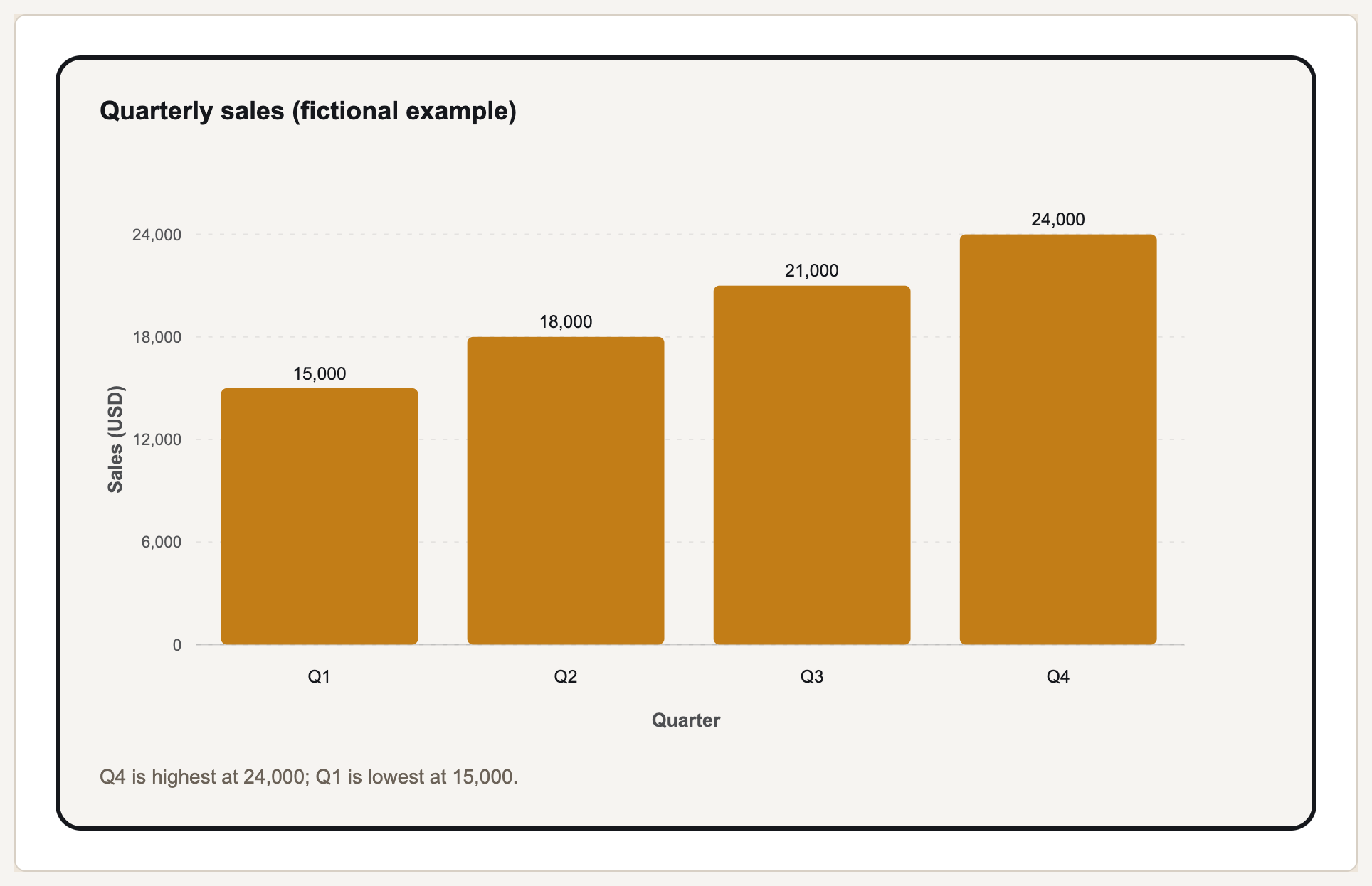
Load four quarters of fictional sales, check the USD unit, then make a bar chart. The PPTX export contains a native PowerPoint chart with an embedded workbook, so its values remain editable.

Quarterly sales report: rendered from the prepared fictional input shown below
Quarterly sales (fictional example)
Prepared input
Quarter,Sales USD
Q1,15000
Q2,18000
Q3,21000
Q4,24000

Review before sharing: Check the four quarter labels, all sales values and the USD axis before sharing. Replace the fictional numbers with your own measured sales.

The renderer preserves supplied values; it does not validate your sales records. Free HTML and SVG carry Gixo attribution. A Prism trial or plan adds clean PNG, PDF and PPTX exports.

Use this example
Bar
Chart type
Title (optional)
Brand treatment
X axis title (optional)
Y axis title (optional)
Chart controls and limits
Input order
Category order
Categories (1–20)
Series (1–8)
Number
Number format
Decimals
Annotation start category
Annotation end category
CAGR period (years)
Arrows use the first series and exact category names on vertical bars. The axis marker does not change the displayed scale.
Start from an example
or paste your data below
Chart data Charts 4 categories and 1 series
Row
1
2
3
4
Brand colors
Brand colors

Applies to this visual and its exports. Your saved Brand Kit stays unchanged.

Your story, in your colors Text and background preview

Series colors apply to charts. Preview shows the renderer’s contrast-adjusted palette.

Verify visible numbers against source text (optional)
Paste the authoritative passage, notes, or table. Prism compares the numeric claims visible in the result; it does not claim to fact-check the surrounding prose.
Authoritative source text

Which chart type should you pick?

Every type reads the same table — first column the category, remaining columns the numbers. What changes is how many series are drawn and how the category column is used.

Gixo Prism Chart Maker: chart types, series drawn, and how the category column is treated.
Chart type Best for Series drawn How the first column is used
BarComparing values across a handful of named categories1–8 (default 4)One labelled group of bars per category
Horizontal barRankings and comparisons with longer category labels1–8 (default 4)One horizontal bar group per category
Stacked barHow several components contribute to each category total1–8 (default 4)Series accumulate above or below zero within each category
LineA trend across an ordered sequence such as months or quarters1–8 (default 4)One point per category, connected in order
AreaThe same trend when cumulative volume is the point1–8 (default 4)One point per category, filled to the baseline
PieA single share-of-total breakdown1 — the first number columnOne slice per category
DonutThe same breakdown with a clear centre for a headline figure1 — the first number columnOne slice per category
ScatterThe relationship between two numbers1–8 (default 4)Plotted as a true X axis when the column is numeric; otherwise points are evenly spaced
RadarComparing profiles across three or more shared criteria1–8 (default 4)Each category becomes a radial axis
WaterfallExplaining positive and negative changes to a running total1 — the first number columnEach category is a change; Prism adds the final total
FunnelShowing conversion or attrition through ordered stages1 — the first number columnEach category becomes a stage whose width is proportional to its value
GanttA compact task schedule1 duration series, or start offset plus durationEach category becomes a task row
Bar + line comboComparing a primary magnitude with one or more trends1–8 (default 4)The first series is drawn as bars; remaining series are lines
HeatmapSpotting high and low values across a matrix1–8 (default 4)Categories form columns and series form rows; colour intensity encodes value
TreemapComparing category shares by area1 — the first number columnEach category becomes a proportional rectangle
Symbol mapComparing supplied locations without external map servicesLatitude, longitude, and optional valueEach location is plotted at its supplied coordinates; value controls marker size
Default (bar)When you want the deterministic default rather than choosing a specific chart type1–8 (default 4)Always renders a grouped bar chart — it is the deterministic fallback, not an inferred choice

Limits are for legibility, not licensing: the defaults include all supplied categories up to 60 for line, area, scatter and combo, or 20 for other types, and the first 4 number columns. The controls can lower categories or raise series to 8 on every plan. When something is trimmed, the warning above the result says so and counts what was dropped — for example “Charted the first 20 categories — 5 more rows weren't shown (max 20)” for a 25-row bar chart — so the “your exact data” promise is never quietly broken.

How to make a chart from your data, step by step

  1. Shape the table. Put the category in the first column and one number column per series, like Quarter,Revenue,Profit. If you have three or more columns and only one of them is numeric, it is read as long format instead: category, series, value.
  2. Paste or upload it. Paste straight into the data box; upload a .csv, .tsv, or .txt file up to 2 MB; or upload an .xlsx workbook up to 5 MB. Excel import safely reads the first worksheet, does not execute formulas or macros, and reports bounded rows or formula cells without saved values.
  3. Confirm the header row. Leave First row is a header ticked when your first line holds column names — those names become the series labels in the legend.
  4. Pick the chart type. Choose among 22 deterministic formats. Pie, donut, and waterfall use the first number column; Gantt accepts duration alone or start offset plus duration.
  5. Choose a theme. 4 presets ship with the tool — Conservative, Bold, Brand conservative (the default), and Brand bold — or open Brand colors to enter HEX values and use the color pickers. A saved Brand Kit can also replace the series palette with your own colours.
  6. Render and read the warnings. Press Make chart. If rows or columns were trimmed to the caps, or a cell could not be read as a number, the warning list above the chart says exactly what happened.
  7. Take the file. Download an HTML or SVG copy free, with a visible Gixo Prism attribution. A trial or plan removes the attribution and adds PNG, PDF, and PPTX — in the PPTX, bar, horizontal bar, stacked bar, line, area, pie, donut, scatter, radar, and bar-and-line combo charts arrive as native PowerPoint charts with their numbers in an embedded workbook; waterfall, funnel, Gantt, heatmap, treemap, symbol map, Marimekko, bubble, Sankey, bullet, slope, and dumbbell charts arrive as native, selectable PowerPoint shapes, rather than a flat picture.

Chart maker FAQ

Is the Gixo chart maker free to use?
Building and previewing a chart is free and anonymous — no account, no card, and no AI charge, because the render is deterministic code running in-process. Taking the output away is the paid line: copying clean HTML without attribution and downloading PNG, PDF, and PPTX files all require an active Gixo Prism trial or plan. Downloading an HTML and SVG copy or embed is free and carries a visible Gixo Prism attribution, and a visual you have saved to your account downloads in every format with or without a plan. Gixo has no free tier; the trial is 14 days and needs no credit card.
What data format does it accept?
Delimited text or the first worksheet of an .xlsx workbook: the first column is the category and remaining columns are numbers. Text uploads may be 2 MB; XLSX uploads may be 5 MB and are bounded to 500 rows, 30 columns, and 100,000 converted CSV characters. Formulas are never executed; Prism reads only their saved cached values.
How many categories and series can one chart show?
By default, a chart includes every supplied category up to its type’s cap: 60 for line, area, scatter and combo, or 20 for other types, with 4 data series. The controls can lower categories or raise series to 8. Pie and donut charts show a single series — the first number column. If your selected limit is lower than your table, the extra rows or columns are trimmed and a warning above the chart says exactly how much was left out.
What chart types are supported?
22 types, including grouped bar, horizontal bar, stacked bar, line, area, pie, donut, scatter, radar, waterfall, funnel, Gantt, bar + line combo, heatmap, treemap, and symbol map. The “Default (bar)” option always renders a grouped bar chart as the deterministic fallback — it does not infer a type from your data, so pick the type yourself when the choice matters.
Does the chart maker use AI?
No. There is no language model in this tool. Axes, scaling, and every plotted point are computed by deterministic code from the numbers you supply, so no value is estimated, rounded away, or invented. In the standard table shape a cell that cannot be read as a number is left blank rather than charted as 0, or the category is left out when it has no readable value. The warning list above the chart explains these omissions — never quietly guessed at.
Can I upload an Excel file?
Yes. Upload an .xlsx file up to 5 MB and Prism converts its first worksheet safely to editable CSV without executing formulas or macros. For Google Sheets, download as .xlsx or CSV, or copy and paste the cells; tab-separated spreadsheet text is detected automatically.
What file formats can I export?
HTML, SVG, PNG, PDF, and PPTX. In the PPTX, bar, horizontal bar, stacked bar, line, area, pie, donut, scatter, radar, and bar-and-line combo charts arrive as native PowerPoint charts with their numbers in an embedded workbook that Edit Data opens; waterfall, funnel, Gantt, heatmap, treemap, symbol map, Marimekko, bubble, Sankey, bullet, slope, and dumbbell charts arrive as editable PowerPoint shapes and text, as does any chart PowerPoint cannot draw the way Prism does, such as a pie with a negative slice or an area chart with a missing value. Either way, labels and colours stay editable in PowerPoint rather than arriving as a flat image. HTML and SVG exports are self-contained with inline styles. Rendering and downloading an HTML or SVG copy are free and need no account; those copies carry a visible Gixo Prism attribution. Copying an attributed embed is free too. A Prism trial or plan removes the attribution and adds PNG, PDF and PPTX.
Do I need an account to use it?
No. The render endpoint is anonymous by design so directories, roundups, and AI answer engines can reach a working tool rather than a sign-in screen. It is rate-limited per visitor at 20 renders a minute, with a burst allowance of 40. Saving work needs an active Prism or Lumen trial or plan. Reopen saved work with an account that has Prism or Lumen product access. Attributed HTML and SVG downloads are available without a plan. Clean premium downloads follow the access shown in the output options.
Can it build a chart from a written description instead of data?
Not on this page. The public maker is structured input only — you bring the numbers. Describing a visual in words and having AI build it, applying a brand kit to every image of a Campaign kit, and AI infographic generation live in the paid Gixo Prism product at gixo.ai/products/visuals.