Venn Diagram Maker
Create a Venn diagram online by naming two or three sets and adding what belongs in each unique and shared region. Prism places your circle labels and overlap text deterministically, so the editable Venn diagram says exactly what you meant.
A Venn diagram uses overlapping circles to show logical relationships between sets. Each circle represents one set, the intersections contain what the sets share, and the non-overlapping regions contain what is unique. Gixo Prism's Venn diagram generator lets you name each circle and enter the text for every region, then draws and labels the geometry deterministically. Venn diagrams work best for two or three sets; beyond three circles, the intersections usually become difficult to read.
Venn diagram generator: two circles or a triple Venn diagram?
Use two circles when the question is simply what two sets share and where they differ. Use a triple Venn diagram when three sets have meaningful pairwise overlaps and one shared center. Prism's Venn diagram generator supports both: choose two sets or a 3-way Venn diagram, name every circle, and enter the text for each unique and shared region. For four or more sets, use a matrix or table because the intersections become difficult to read.
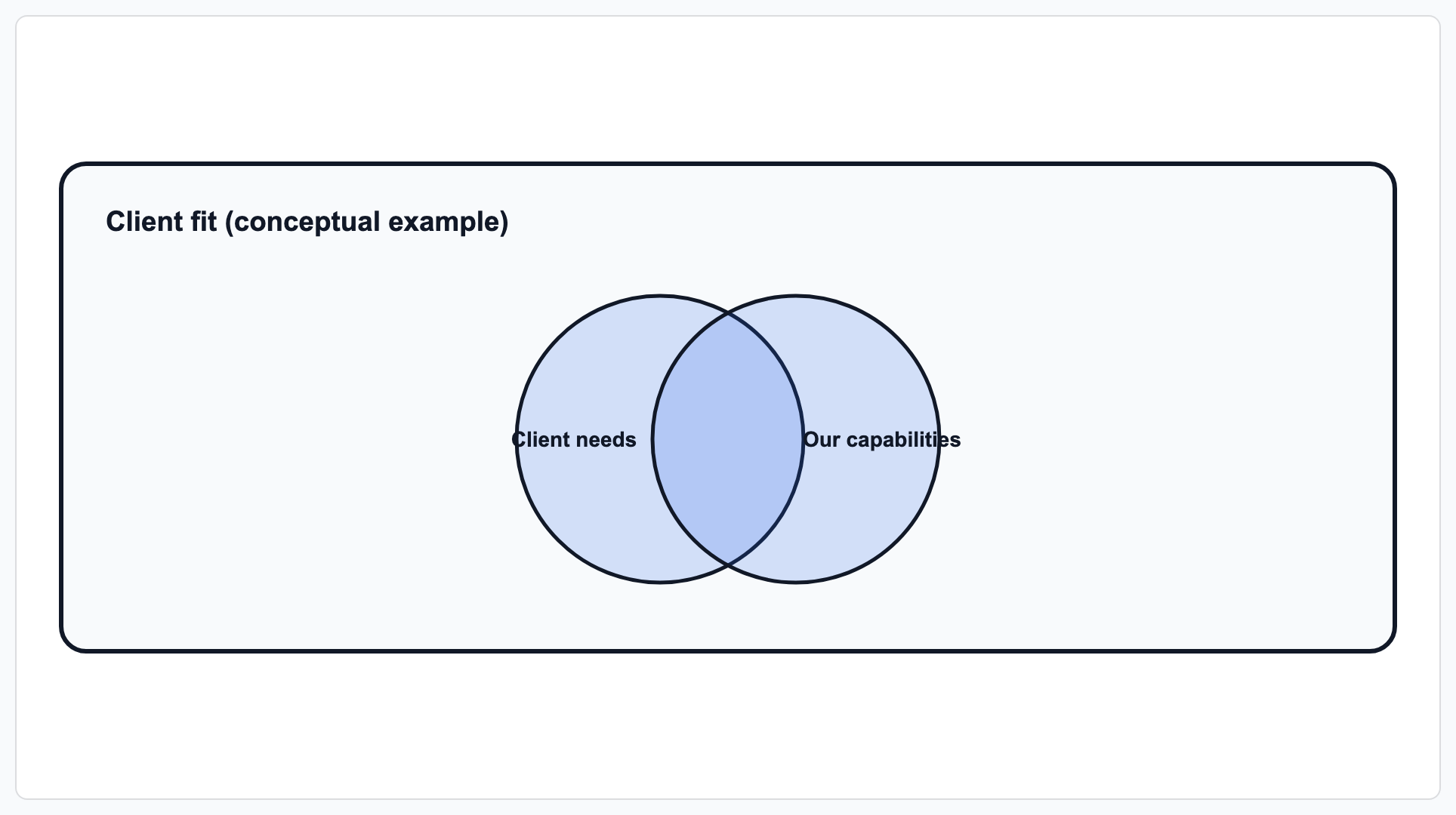
An example 2-set Venn diagram — Prism places each label and the overlap region deterministically.
What makes a Venn diagram maker actually usable?
A Venn diagram maker online should do more than draw overlapping circles. The hard part is keeping set labels, unique entries, pairwise overlaps, and the shared center in the correct region, legibly, every time.
Build a 2 circle Venn diagram to compare two sets, or a 3 circle Venn diagram for three — Prism's Venn geometry positions the circles and every overlap region for you.
Name each circle and type what goes in each unique and shared region. Prism renders exactly the text you enter — no generic placeholder labels, no re-typing into a template.
No AI image model draws these circles. Prism renders the Venn geometry deterministically, so overlap text sits in the correct intersection every time — no garbled words, no drifted circles.
Apply your brand palette to the circles and it stays consistent with every other chart and diagram you build in Prism — plus theme presets (conservative, bold, brand-conservative, brand-bold) to start from.
Rename a set, rewrite the overlap text, or switch from two circles to three, and the Venn re-renders exactly. Export as clean, self-contained HTML/SVG to drop into a deck, doc, or page.
When a Venn isn't the right shape, the same diagram maker covers process, cycle, pyramid, funnel, tree, pillars, matrix, concentric, and stack geometries — all deterministic, all on-brand.
When should you use a Venn diagram?
Reach for a Venn diagram when your point is about what two or three things share and where they differ. It's the right shape when the overlap itself is the insight.
- Compare two options or categories — a 2 circle Venn diagram makes the shared middle and the two unique edges obvious at a glance.
- Find the sweet spot of three factors — a 3 circle Venn diagram is the classic way to show where "desirable, feasible, viable" (or any three criteria) all meet.
- Audience or requirement overlap — which features two personas both need, which skills three roles have in common, which markets two products both serve.
- Teaching set relationships — unions, intersections, and differences read instantly as overlapping circles.
Honest limit: a Venn diagram is best for 2 or 3 sets. Four or more circles create so many tiny overlap regions that the diagram becomes hard to read — if you have four-plus categories, a matrix, table, or grouped list usually communicates better, and Prism's diagram maker covers those shapes too.
How to make a Venn diagram step by step
A clear comparison question comes before the circles. Follow these six steps to create a Venn diagram whose regions are logically correct and easy to read.
Write the question the diagram must answer and state the full population being considered. For a survey, the universe might be all respondents; for a product comparison, it might be the shortlist under review.
Use two sets for a direct comparison. Choose three only when the three unique regions, three pairwise intersections, and one shared center all add meaningful information.
Compare categories at the same level: two products, two audiences, or three criteria. Avoid mixing a broad class with one member, such as “software companies” and one named vendor.
Ask whether the item satisfies Set A, Set B, and, for a three-circle diagram, Set C. Place it once in the most specific applicable region: one set only, a pairwise overlap, the shared center, or outside all circles.
Enter the set names and region text, then apply a theme preset or Brand Kit. Prism positions the circles and labels without manual dragging or an image model guessing where words belong.
Check every intersection against every relevant set definition, shorten crowded labels, and confirm color is not the only cue. Export clean HTML/SVG for a deck, document, or page.
Two-circle Venn diagram example: solar and wind energy
A two circle Venn diagram has three primary content regions: Set A only, the intersection of A and B, and Set B only. An outside region can show items that belong to neither set.
| Solar energy only | Solar and wind: A ∩ B | Wind energy only |
|---|---|---|
| Uses photovoltaic panels | Renewable energy sources | Uses turbines moved by air |
| Output depends on sunlight | Generate electricity without fuel combustion during operation | Output depends on wind conditions |
| Often installed on rooftops | Require site, infrastructure, and grid planning | Often installed in wind farms |
This example works because the categories are parallel and the shared entries satisfy both definitions. The intersection should not become a miscellaneous area for statements that feel generally related. “Produces energy” may be true, but it is usually too broad to provide useful comparison evidence.
In set notation, A ∩ B means the intersection: items in both sets. A ∪ B means the union: everything in either set or both. A − B means the difference: items in A but not B. If the diagram includes a rectangle representing the universe, the space outside both circles holds items in neither set.
Three-circle Venn diagram example: the 3 circle Venn diagram of desirable, feasible, and viable
A 3 circle Venn diagram template contains seven internal regions: three unique regions, three pairwise intersections, and the center shared by all three sets.
| Region | What it means in a product decision |
|---|---|
| Desirable only | Customers value the idea, but feasibility and commercial viability are not established. |
| Feasible only | The team can build it, but customer demand and the economic case are unproven. |
| Viable only | A commercial opportunity appears possible, but value and implementation remain uncertain. |
| Desirable + feasible | The idea solves a customer problem and can be built, but its economics need work. |
| Desirable + viable | The customer and commercial case are strong, but the implementation is technically blocked. |
| Feasible + viable | The idea is buildable and commercially plausible, but customer evidence is weak. |
| All three | The initiative has evidence of customer value, technical feasibility, and commercial viability. |
The middle of a triple Venn diagram is not a general “best ideas” box. An entry belongs there only if it satisfies all three set conditions. Likewise, a pairwise region such as desirable and feasible must exclude the third condition; if commercial viability is also established, the entry belongs in the center.
Together, these two- and three-circle examples of Venn diagrams show the essential placement rule: test membership first, then put each entry once in the most specific region that satisfies the evidence.
How to choose a Venn diagram template
A template is a planning structure, not a substitute for comparison logic. Choose the fewest circles that can answer the question clearly.
| Template | Best use | Required regions | Main risk |
|---|---|---|---|
| Two-circle Venn diagram template | Direct comparison between two products, audiences, texts, or categories | A only, A and B, B only; optionally neither | Putting vague similarities in the center |
| Three-circle Venn diagram template | Three related sets whose pairwise and three-way overlaps all matter | Three unique, three pairwise, one central; optionally outside all | Misplacing a pairwise item in the center |
| Venn diagram with counts | Membership or survey data with clearly defined inclusion rules | A separate count for each non-overlapping logical region | Duplicating intersection counts in circle totals |
An online Venn diagram maker is most useful when the output remains editable: set names can change, entries can move between regions, and the layout can switch from two circles to three without rebuilding the graphic. In Prism, you start with the appropriate circle count and your own labels rather than forcing your analysis into fixed placeholder text.
Keep entries concise, label every circle with the category name, and provide enough context to identify the universe or population. Equal circle sizes normally communicate logical membership, not quantity. If area must represent magnitude, you need a specialized area-proportional diagram rather than a standard comparison template.
Common Venn diagram mistakes and better alternatives
The diagram is appropriate only when membership and overlap are the main relationship.
Check before publishing
- Compare categories at the same level of abstraction.
- Place every item once, in its most specific applicable region.
- Require every intersection entry to satisfy every relevant set.
- Shorten sentences before they crowd a narrow overlap.
- Use labels or patterns so color is not the only cue.
- Do not imply that a larger-looking circle contains more members.
Choose another visual when
- Sequence matters: use a timeline.
- Steps or decisions matter: use a flowchart.
- Options need scores or weights: use a decision matrix.
- Categories are nested: use an Euler diagram or hierarchy.
- Quantity matters: use a bar chart or data table.
- Four or more sets matter: use a matrix, filtered table, or several focused comparisons.